A Stylish New Look for an Aging Boston Penthouse
March 27, 2019
Text by Maria LaPiana Photography by Michael Partenio
There’s no question the condo in downtown Boston needed freshening up; it was dated and showing its age. But it was a waterfront penthouse, and its new owners were smitten with its views—not to mention its possibilities. So the empty-nesters went for it and commissioned Boston interior designer Rachel Reider to oversee a complete renovation. They wanted their new pied-à-terre to better suit them and their lifestyle and reflect the modern aesthetic they love.
It helped that Reider already knew the couple and understood them perfectly. “A layer of trust is critical to the success of any collaboration,” says the designer. Since the pair had already worked with her on six homes—from the suburbs to the city, including a ski house and a beach retreat—their confidence level was high.
“We had clear direction on what they wanted from a functional perspective,” Reider says. “That was really very helpful in informing the design.”
One thing she knew for sure was that nothing was to block the water views.
The project was “a little more urban” than she is used to, but Reider greeted the challenge with enthusiasm. “I wanted to create a space that was modern and stylish, in keeping with its downtown location—but was still comfortable and inviting.”
She took the 1,500-square-foot, two-bedroom, two-bath unit down to the studs, reconfiguring baths and installing a new kitchen, electrical, and sound systems. Nothing was repurposed, and no furniture came along for the ride, giving Reider a totally clean slate.
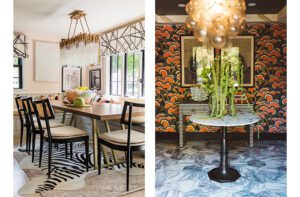
If there’s one thing that defines this residence, it’s the designer’s bold and innovative use of finishes and materials. The result is a layered, thoughtfully composed, luxe space that showcases texture, jewel tones, and sculptural furnishings. Everything is tactile, intentional, and undeniably gorgeous.
The palette was inspired by the environment, says Reider, and the clients’ preference for cooler hues. Metallic tones and accents bring an urban vibe to the space, while the varying shades of blue reference the water views.
Because the designer and homeowners opted for beautiful wall coverings to add interest and depth, there isn’t a lot of artwork vying for attention. One exception is the large-scale painting in the living room by artist David Kidd. Says Reider: “I love that the piece is striking while also soft and ethereal. It doesn’t compete with the other beautiful finishes but rather complements them.”
Another attention-getter: a dazzling fireplace wall crafted of chiseled limestone tile that mimics the movement of water.
Materials played a starring role in the kitchen, too. “We loved working with Venegas and Company on the kitchen,” says Reider. “Every finish is unique—from the metallic wire-brushed base cabinets and the leather upper cabinets to the metal island.”
The bathrooms were challenging because the footprints weren’t large, so Reider used lighter reflective materials and finishes to give the illusion of more space.
The mirrored wall in the living room has a good backstory. “The homeowner wanted the water view to be the first thing you saw on entering the apartment,” explains the designer. To do that, they needed mirrors. “We brainstormed different ideas that would achieve this effect, but also be more design-forward than a standard mirrored wall,” says Reider. The solution: mirrored panels of different sizes were treated with various finishes, from clear to antique to smoked glass, and strategically arranged to create a statement wall that did the trick.
To truly make their home their own, the couple wanted to integrate a lot of custom pieces into the design. The coffee table in the living room is one of the designer’s favorites. “We designed it to avoid a bulky piece with a large footprint, while providing maximum surface space. It features three different layers, each wrapped in a different texture, from shagreen and parchment to a metallic finish, all of them adding interest,” she says.
From wall to wall and ceiling to floor, this renovation story starts and ends with texture. Reider admits she “usually gravitates towards fabrics and furnishings” to make her mark on a project. But knowing how much her clients appreciate harder materials and finishes, she designed accordingly—and delivered with more than a measure of success.
Project Team
Interior design: Rachel Reider, Rachel Reider Interiors
Kitchen design: Donna Venegas, Venegas and Company
Share
![NEH-Logo_Black[1] NEH-Logo_Black[1]](https://b2915716.smushcdn.com/2915716/wp-content/uploads/2022/08/NEH-Logo_Black1-300x162.jpg?lossy=1&strip=1&webp=1)










You must be logged in to post a comment.