Kitchen & Bath Design 2018
September 21, 2018
New England designers prove there’s no one formula for making our most functional spaces beautiful.
Text by Paula M. Bodah
Simply Stunning
There’s “wow” factor aplenty in this kitchen, one of the happy results of Mary McKee’s renovation of a late-nineteenth-century house in Newton, Massachusetts. McKee broke through walls to open the kitchen to the living room and to create a back entry that holds a charming floating walnut desk. Sunlight streams in through a new bank of casement windows across a long expanse of silvery-hued quartzite countertops and onto pristine white walls and ceilings. A quartzite-topped prep island steps down to a walnut-topped dining table with enough leather-clad chairs to seat a small crowd. But the truly stunning elements are found in the less obvious details conceived by McKee along with Pierre Matta of Newton Kitchens & Design. Matta suggested the waterfall edges for the island and the counter ends, and it was his brainstorm to add the walnut-trimmed niche to the back of the island. The homeowners favor streamlined elements, so Matta designed the narrow stainless channels that fill in for drawer pulls on the flat-panel cabinetry. In a final, warming touch, McKee washed the white oak floors with a coat of gray.

Architectural and interior design: Mary McKee, Mary McKee Design
Cabinetry design: Pierre Matta, Newton Kitchens & Design
Builder: Everett Andrews, EA Custom Millwork
Photography: Sabrina Baloun, Sabrina Cole Quinn Photography
Shades of Gray
Designer Kristina Crestin confesses that she doesn’t usually take on projects with a traditional bent, but she acquiesced when builder Matt Ostrowski asked her to help design a new kitchen for his Essex, Massachusetts, client. “He said, ‘I promise it’s not white,’ ” she recalls with a laugh. The homeowner had never loved her kitchen; cherry cabinets and black granite made it too dark, and its layout lacked an efficient flow. Crestin and Ostrowski suggested relocating the kitchen to a corner of the house, a change that offered more options for bringing in light. Four-over-one windows with simple framing flank the range on one wall, and on a perpendicular wall, the sink and a long expanse of counter look out onto the scenery through a bank of five additional windows. The vaulted ceiling and upper walls were painted pale gray, and Crestin grounded the space by giving the cabinetry a coat of Benjamin Moore’s Quarry Rock, a warm gray-green. The rugged-looking quartzite floor in shades of sea green and gray adds texture and plays up the casual, farmhouse feel.
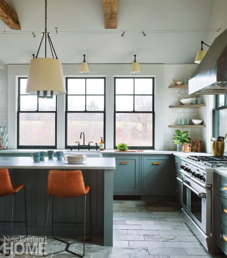
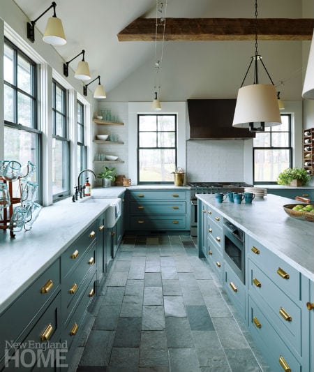
Interior architecture and design: Kristina Crestin, Kristina Crestin Design
Builder: Matt Ostrowski, Covenant
Photography: Jared Kuzia
Updated Classic
Jamie Keskin’s suburban Boston clients asked for a kitchen she calls “classic, not too trendy, but with a unique factor.” The designer obliged with this kitchen done up in a fresh rendition of farmhouse style. Simple white cabinets with matte bronze pulls and knobs form the classic backdrop. A farmer’s sink, the island’s reclaimed wood top, and the light oak stain on the wide-plank floors enhance the farmhouse feel, while counter stools and the homeowners’ own casual dining table and chairs add a midcentury modern sensibility. Rather than the expected trio of smaller pendants centered over the island, Keskin went bigger and hung just two glass-globe fixtures. The windows above the sink look out over a pretty view of the backyard and adjacent conservation land, so Keskin opted to forgo window treatments. And for the requested unique factor, the designer installed a show-stopping backsplash of Pratt & Larson fan-shaped tile in smart, glossy navy.
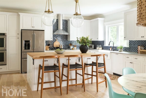
Architect: Ann M. Walters, Walters Design Studio | Architecture
Interior design: Jamie Keskin, Jamie Keskin Design
Builder: Dave Giannetta, Giannetta Real Estate & Construction
Kitchen design/installation: Maki Construction
Photography: Kyle Caldwell
Grand Style
An Old World feel predominates in this New Hampshire kitchen, but in every meaningful way it’s also a space for the twenty-first century. Boston-based designer Michael Carter and (now retired) kitchen designer Dalia Tamari joined forces to devise both the elegant, timeless look and the efficient flow and abundance of storage that today’s home cooks crave. Tamari suggested using a variety of cabinetry styles to give the room the look of having been put together over time. One wall holds a bank of sturdy oak Christopher Peacock cabinets that cleverly disguise the refrigerator, while the island and perimeter cabinets are painted a parchment color. Glass-front cabinets in a distressed blue-gray were chosen for their furniture-like look. Tamari also opted for variety in the countertops, using honed Absolute Black granite for the perimeter and hard-wearing La Dolce Vita quartzite for the island. The commercial-grade range makes a striking focal point with its custom-designed bell-shaped hood and—Carter’s favorite element—an antique metal fireback from the Netherlands that adorns the backsplash.
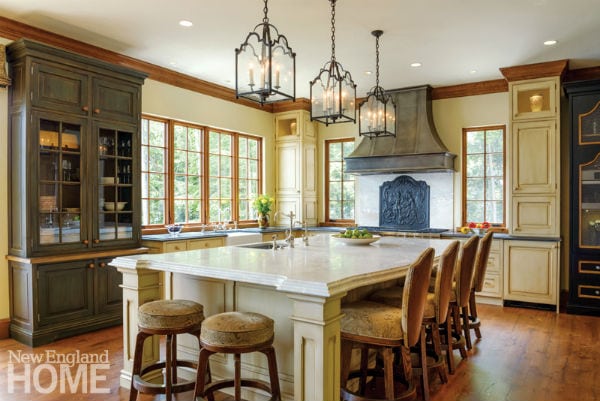
Architecture: Mehren Freeman, Mehren Freeman Architect
Interior design: Michael Carter, Carter & Company
Kitchen design: Dalia Tamari
Builder: McGray & Nichols
Photography: John W. Hession
White Makes Bright
It’s no mystery why white has become a perennial favorite for kitchens. White projects a pleasing sense of order and cleanliness, it adapts to just about every style from classic to modern, and it won’t clash with the palette of nearby rooms. That said, a wise design team knows all that pale loveliness runs the risk of feeling cold and sterile. For the kitchen in this new home in Needham, Massachusetts, Jessica Chabot and Ryan McDonnell of Hawthorn Builders cozied things up nicely with just a few clever elements. Wood accents carry warmth throughout the open kitchen and dining area, from the pantry’s alder cabinets to the range hood to the rustic dining table to the doors leading to the porch. Wood—in this case, walnut—makes an appearance, too, on the prep side of the kitchen’s large center island. Oil-rubbed-bronze light fixtures and cabinet hardware add more warmth, while blue leather island chairs whose backs sport a perimeter of nailhead trim lend a modern touch. “It has a classic feel,” says Chabot, “but it’s all updated a bit.”

Architecture: Michael McKay, McKay Architects
Construction and interior design: Jessica Chabot and Ryan McDonnell, Hawthorn Builders
Photography: Michael J. Lee
Sophisticated Sanctuary
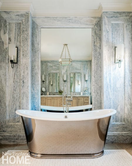
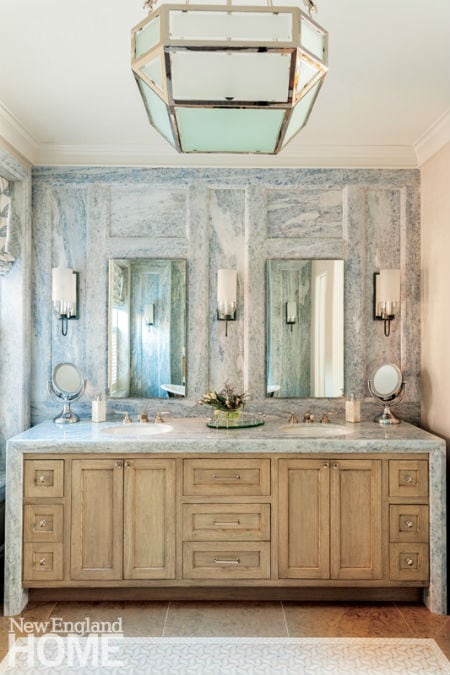
The entire third floor of this six-story brownstone in Boston’s Back Bay serves as the master suite for the husband and wife. As the parents of four boys, “it was important that they have a respite floor,” says designer Paula Daher. Their spacious bath is designed to further that feeling of respite, with its modern take on Old World elegance. The beautifully detailed wall paneling, executed by Cumar, is crafted of twelve slabs of honed Calcite Azul limestone in a pale blue that evokes the sea. The same stone forms the baseboards and window trim. “It was truly a feat,” Daher says of the work by Cumar. The white oak vanity was given a slightly distressed finish for an appropriately antique look, then topped with polished Damask White marble that spills over the sides in a waterfall effect. Daher installed a mirror in a niche behind the freestanding tub—which is also mirrored—to catch and reflect the light from the windows and the Urban Electric sconces and ceiling light.
Interior architecture and design: Paula Daher, Daher Interior Design
Architecture for house: Ronald Payne, Payne Collins Design
Builder: CPAC Contracting Services
Photography: Michael J. Lee
Slab Happy
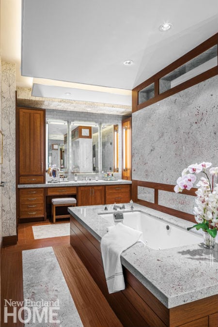
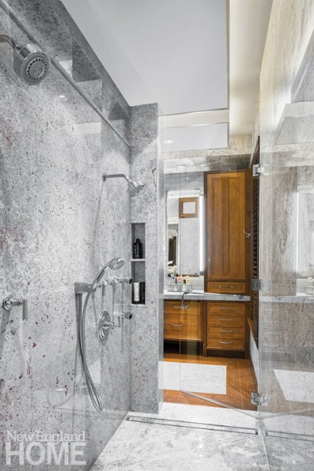
The design pros who created the master bath in this new suburban Boston house can’t say enough good things about one another. No wonder, given the spectacular results of their collaboration. The unusual layout conceived by architect John Cronin and designer Sharon Staley puts his-and-hers vanities and water closets (each with its own built-in magazine rack, notes builder Peter Fallon) on opposite walls. Between them, the tub and shower sit on either side of a massive slab of marble. Slab marble was used to top the long vanities, and still more slabs are set into the radiant-heated, wood-look porcelain-tile floor. The walk-through shower has a hidden infinity drain and multiple showerheads set at varying heights to accommodate both husband and wife. On the flip side of the wall, the tub is encased in mahogany. The rail-like mahogany trim at the top of the wall echoes the inset trim lower down, but is left open to let shower steam escape. Walnut-trimmed quarter-sawn-oak cabinetry outfits the vanity areas. The glass tile that frames the mirrors and the floating soffits above are backlit, casting a glow on the scene.
Architecture: John J. Cronin Jr.,The MZO Group
Interior design: Sharon Staley, Sharon Staley Interiors
Builder: Peter Fallon, Fallon Custom Homes & Renovations
Photography: Greg Premru
Share
![NEH-Logo_Black[1] NEH-Logo_Black[1]](https://b2915716.smushcdn.com/2915716/wp-content/uploads/2022/08/NEH-Logo_Black1-300x162.jpg?lossy=1&strip=1&webp=1)



You must be logged in to post a comment.