Midcentury-Modern Revived
May 29, 2018
A virtuoso performance by the design team brings a midcentury-modern home from “unique” to uniquely suited to its owners.
Text by Lisa H. Speidel Photography by Greg Premru
The family of five had been searching for a house in Hingham for three years, looking for something unique, when a midcentury-modern ranch hit the market. “I fell in love with the property,” remembers the wife, “and I figured the house could be fixed.” As for selling her husband on the home, which admittedly needed some work, the distant water views did the trick.
Originally built for the Talbot family (of clothing store renown) in 1949 by Boston-based architect Robert Woods Kennedy (he famously redesigned Julia Child’s kitchen), the house had undergone three additions. All the tinkering over the years resulted in a home that lacked any kind of cohesion. But it definitely fit the “unique” bill.
The family moved in, eager to live in the space before embarking on a major renovation and also buying themselves time to find the right architect. That piece of the puzzle fell into place while visiting friends who had worked with Boston-based LDa Architecture & Interiors. “They understood modern in the style of modern we wanted—warm, inviting, not clinical,” the wife says about the LDa team.
Principals Kyle Sheffield and Douglas Dick relished the challenge. “The bones were great,” Sheffield says, “but it needed a complete reprogramming; we had to stitch the house back together.” From his perspective, there were three primary issues: the existing layout put private and public spaces in awkward relationship to each other; the various parts of the house needed a more natural connectivity; and functionality had to be improved to accommodate the family.
Sheffield worked primarily within the existing footprint; the only addition to the first floor is an entrance gallery, which serves the dual purpose of showcasing the owners’ art collection and shepherding guests through a more formal entry and between the public and private spaces in the house.
The gallery leads to the glass-front living room, which occupies the same space as the original. From there, Sheffield rejiggered the layout. Turn right for the open-concept dining area and kitchen. A left takes you to the mudroom (which doubles as the family’s entrance), a guest suite, office, and laundry room. A little further down, a private wing is dedicated to the master suite, master bath, and dressing closet.
Sheffield incorporated two second-story additions to give the kids their own space. Above the kitchen sits a family room with pretty water views, while three bedrooms, a bath, and a study nook perch over the guest/mudroom area.
Given the sprawling nature of the house, certain vantage points offer a view through the outdoors and into another area of the house, making it critical to have a cohesive architectural language both inside and out, says Sheffield. He used the original v-groove siding as a cue, adding swaths of horizontal western red cedar. Inside, shiplap paneling strategically placed here and there, including in the living room, kitchen, and master bath, smartly plays off the exterior. Moving and enlarging windows created a further architectural statement while helping merge outdoors and in. “Midcentury homes rely on large windows as part of their design because there is very little architectural detail,” points out Sheffield. Visible from those windows is a stunning landscape executed by Parterre Garden Services that keeps with the overall aesthetic of the project. “I wanted Olmsted-esque but modern,” says the wife.
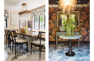
The contemporary interior was a group effort. The homeowner enlisted an old friend, Susan -Collins Weir, who runs an interior design firm in San Francisco, to help with furnishings, decorative light fixtures, and decor, while Sheffield designed the millwork (executed by Tradern Fine Woodworking, a Newton, Massachusetts, company) and selected the tile, stone, plumbing, and other built-in finishes. The living room’s old hearth was removed, and an Ortal fireplace with a Pietra Cardosa stone surround added. Collins Weir updated the owners’ existing collection of antiques and art with more modern furnishings and textiles. “It created a beautiful contrast that brought warmth to the house,” she explains.
In the kitchen, gray cabinetry, stainless steel countertops, and a waterfall-edge island swathed in White Fantasy quartzite combine for a clean aesthetic and meal-time efficiency, and echo the muted, neutral palette used throughout the house.
The homeowners are delighted with the remarkable transformation. “Kyle thought through every little precise detail,” the wife says. “We backed off our preconceived notions of what the house should be and let him show us what it could be. That’s when it really worked.”
Share
![NEH-Logo_Black[1] NEH-Logo_Black[1]](https://b2915716.smushcdn.com/2915716/wp-content/uploads/2022/08/NEH-Logo_Black1-300x162.jpg?lossy=1&strip=1&webp=1)






You must be logged in to post a comment.