A Glamorous Carriage House on Boston’s North Shore
May 9, 2018
Shimmer, sparkle, and shine add City-of-Lights glamour to a carriage house-turned-condo on Boston’s North Shore.
Text by Susan Kleinman Photography by Eric Roth Produced by Kyle Hoepner
They weren’t really house-hunting. But when a retired couple from Boston’s North Shore took one look at this condominium in a former carriage house, they were enchanted.
“We were getting tired of taking care of our property,” says the homeowner, “but we didn’t think we would ever find the kind of look we wanted in a condo. A friend who is a real estate agent brought us over to see this just for fun—and the minute we saw it, we fell in love.” The unit had been renovated by Wilson Kelsey Design, and was even featured in New England Home back in the spring of 2010, so it was in excellent condition. “And it had wonderful bones,” the homeowner says. “Coffered ceilings and elegant moldings, a marble floor and a gorgeous fireplace. We wrote a check for the deposit right then and there.”
That same night, she called interior designer Starr Daniels, a close friend who had decorated the couple’s previous Massachusetts residence, as well as the home in Florida where they now spend most of the year. Daniels took one look at the chic European touches that had seduced her client, and envisioned a “perfect Paris apartment”—albeit near the Atlantic Ocean rather than the Seine.
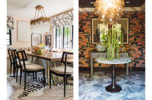
“The floor in the entryway really helped drive the design,” Daniels says of the checkerboard marble honed to an elegant sheen. To enhance that glow, she covered the stairwell’s dark Venetian plaster with textured white wallpaper that adds interest while making the most of the home’s somewhat limited light. “This is the center unit of the condo,” she explains, “so there are no windows on the sides of the home and it can be dark. Part of the challenge here was to add and reflect light wherever we could.”
Two shimmering chandeliers—one gilt, the other beaded—help meet that challenge beautifully in the entry, and a wall sculpture in gold and black glass adds a gem-like sparkle above the stairs. “I saw the pieces in a Boston-area art gallery,” Daniels recalls, “and it looked just like jewelry for the wall. I knew immediately that we had to have it for this project.”
A similar “gotta have it” impulse took hold when she laid eyes on the white paper sculpture that hangs on the facing wall. Three-dimensional but entirely monochromatic, the sculpture adds interest without interrupting the clean expanse Daniels created by painting surrounding walls Farrow & Ball’s Wimborne White. The living room sofa and rug are white, as well, with black and taupe accents introduced sparingly in a painted-paper–covered end table and two French Louis XVI fauteuil chairs.
While the room’s palette is basic, the effect is anything but bland. On one wall, a large topaz-glass and gold-rivet mirror sparkles. On another, Venetian-glass sconces (a family heirloom) twinkle reflectively. Above the fireplace, a sculpture of white birch logs is lined in gold—“it’s a tongue in cheek reference to the typical New England fireplace log,” says Daniels—while shiny brass andirons take the shimmer one step further. A two-piece black and gold coffee table helps bounce the light around, while serving as an unusual focal point. “I like to find things that are different, but that stand the test of time,” says Daniels, who sourced the Portuguese table on 1stdibs. “Making a space elegant is all about attention to detail, and to staying true to your vision of a room.”
In the adjacent dining area, custom-made wallpaper by de Gournay features the sort of monkeys you might see with organ grinders in a Paris park, hand-painted with twenty-four-karat gold accents. And then, just as things might have crossed the line from “everyday elegance” to “overdone opulence,” Daniels expertly reigned it in. “That’s the key to working with gold,” she says. “You have to exercise restraint. You have to know when enough is enough.”
Fortunately, she had plenty of other space-brightening tricks up her sleeve. In the media room off the kitchen, she painted the paneled walls bright cobalt blue, a custom color mixed and remixed five times until it was exactly right. “Blues are tricky,” she explains. “If you aren’t careful, a color like this can look neon, or can make everything look too dark.” Formulated to high-gloss perfection, the hue accomplishes exactly what Daniels had planned, lending the room a sunny feeling even though its two windows are small.
In the kitchen, too, a dramatic color change adds an airy feeling and a more contemporary look. Existing red brick was painted over in a glossy white, and custom cabinetry from Downsview Kitchens of Boston was painted a soft gray blue that looks modern but not industrial. Other aspects of the kitchen, redesigned by Downsview’s Heather Kahler and constructed by Mike Doiron of The Housewright Company, enhance the clean, up-to-the-minute feeling: a larger island replaced two smaller ones in the room’s center, making the space more streamlined and easier to navigate. Shutters around the window were removed to create the illusion that the pane is larger than it actually is, and glass fronts on several of the new cabinets add reflectivity and a sense of openness.
Upstairs, the home’s three bedrooms continue the main floor’s elegant vibe, and meet the client’s desire for très-chic modernity and all-out comfort. In a guest room the homeowners’ daughter uses when she visits, custom wallcovering by Phillip Jeffries features tiny white embossed roundels that add dimensionality and sheen. In the master bedroom, a pair of citron chairs bring sunshine on the cloudiest day, and punches of lilac make the space feel springtime fresh even in the dead of winter. The gold-accented nightstands that flank the bed add a touch of the first floor’s glow and provide plenty of room for books and drinks, as well.
“I want things to be comfortable and functional,” says Daniels. “And I believe you can achieve that and still have a glamorous outcome.”
The homeowner agrees wholeheartedly. “This turned out exactly the way we envisioned it,” she says. “I just love it—every part of it.”
Share
![NEH-Logo_Black[1] NEH-Logo_Black[1]](https://b2915716.smushcdn.com/2915716/wp-content/uploads/2022/08/NEH-Logo_Black1-300x162.jpg?lossy=1&strip=1&webp=1)








You must be logged in to post a comment.