An Elegant Pied-à-Terre in Boston’s South End
March 9, 2018
A design team that “gets it” undertakes another gorgeous renovation for favorite clients in Boston.
Text by Maria LaPiana Photography by Laura Moss Produced by Kyle Hoepner


When it comes to getting hired, it’s often not what you know but who you know. When it comes to getting hired over and over again by the same client, it’s no longer just who you know—but how well you know them.
This renovation of an elegant apartment in Boston’s South End is the fourth project that Herbert Acevedo and Kevin Miller—the creative team behind Shor Home, a home furnishings shop and design service in Provincetown, Massachusetts—have completed for the same couple since 2008. “We know these clients well,” says Acevedo. “We understand their personalities and how they live, their likes and dislikes.”
Being so in tune with them is what makes the collaboration work so well.
Located on a leafy street close to some of the city’s finest restaurants and shopping, the apartment, in a former residence hotel dating from the 1800s, has rooftop and city views and plenty of charm. “They wanted to use it as a pied-à-terre, since they have other homes,” Acevedo explains. As such, it fit the bill perfectly.
The clients, two gentlemen who travel frequently for work, asked their reliable design team to help them rethink the apartment space. They wanted their home to be low-maintenance so it could be closed up when they are away. But, says Acevedo, “We knew that their level of required comfort was high.”
The added challenge was getting the place to look gorgeous while meeting the owners’ divergent visions.
That part was tricky.
“While they both appreciate an upscale interior, they have two distinct visions in achieving it,” says Acevedo. “One is a modern minimalist and the other has more traditional leanings. It’s always a back-and-forth that results in complex designs that have depth and clarity. Combining the two makes for a lively conversation indeed.”
The place had the requisite good bones, and while not large at 943 square feet, it had handsome original details, high ceilings, big windows, and marvelous light. “We knew it would feel much larger with the right treatments,” says the designer. “When it’s only two people and it’s not used year-round, it’s like a nice hotel. You’re in, you’re out. It looks good, it works.”
The clients wanted luxe. The apartment had to have a European feel to it, with comfortable, chic furnishings and an “ahh” factor.
Miller and Acevedo reconfigured the space formerly occupied by two bedrooms into a larger master with a dressing area that incorporates hidden closets. They created a den that doubles as a guestroom. Stealing space from the kitchen (which was completely redone), they added a new master bath and a second guest bath. They also replaced all doors and floors, added new closets throughout, and installed new mechanical systems, including central air conditioning.
That second bath could have given them all a headache, but luckily, when contractor Ted Schwartz of Clarion Construction was called in to take a look, he discovered a space between this apartment and the floor below it. Thus they were able to install the plumbing with relative ease. Miller and Acevedo have high praise for the “solutions-oriented” Schwartz, who they say understood their language.
Miller recommended making doorways wider and taller for a much more spacious feeling. The windows became focal points, as one naturally turns toward the light. Many are covered in simple white linen, while the tallest ones called for more serious dressing.
Acevedo layered blue accents onto a palette of soft grays and taupes. One neutral flows into the next, and rich gold notes add glimmer and shine.
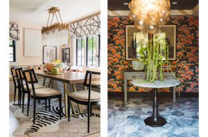
The designer went bolder with pattern in the living areas, playing with contrast at every turn. “The homeowners’ art is very graphic and modern, so we wanted a foil for that,” he says. In the den, for instance, a silky horizontal stripe for the drapes and a strong geometric Blackburn rug from Stark “marry well with the classic secretary and wing chair,” Acevedo explains. Twin ottomans from Hickory Chair wear a linen stripe on the sides and leather on top. “I love that den, with its sublime mix of pattern and color that just works; the dark walls are so moody but exactly right,” he says.
The master bedroom was kept to pale, quiet colors—with the exception of the dramatic headboard upholstered in rich, dark mohair velvet accented with nailhead trim. A hand-knotted Massena rug from Annie Selke provides a graphic punch.
The couple’s eclectic art collection includes an abstract by William Freed that hangs over the living room fireplace, a whimsical Bunnies painting in the dining room by Hunt Slonem, a set of bedside landscapes from a Sotheby’s auction of European antiques, and a surrealist painting by Matt Holmes in the master bath.
The furnishings—all new to the space except for the armoire in the living room, the secretary in the den, and the dining chairs, which were re-covered—mix antiques and finds like the living room’s vintage Quintus cocktail table. The inlaid secretary and tiered pendant in the den are notable for their scale and detail.
The apartment reads custom throughout, thanks to an array of important details and a variety of textures and finishes. These include lacquered black doors, a soft gray stain on the floors, and Carrara marble tile in the master bath. The designers used lush fabrics—from upholstered pieces and floor-to-ceiling drapes to pillows—bringing texture, pattern, and color to the rooms in unique ways. A sophisticated mix of subtlety and drama is everywhere; it all feels as good as it looks.
“We really enjoy collaborating with these clients because they’re so open to unconventional ideas and designs,” Acevedo says. “They stretch us in ways that make us more creative.”
This year, clients and designers are embarking on yet another project together—a new place in Charleston, South Carolina—number five. Acevedo laughs: “Did I mention we have a very symbiotic relationship?”
Project Team
Interior design: Herbert Acevedo, Shor Home
Interior architecture: Kevin Miller, Shor Home
Builder: Ted Schwartz, Clarion Construction
Share
![NEH-Logo_Black[1] NEH-Logo_Black[1]](https://b2915716.smushcdn.com/2915716/wp-content/uploads/2022/08/NEH-Logo_Black1-300x162.jpg?lossy=1&strip=1&webp=1)




You must be logged in to post a comment.