Cape Cod Cottage Chic
May 31, 2017
A weathered waterfront Cape cottage gets new life with a restoration that honors the old and welcomes the new.
Text by Kim Johnson Gross Photography by Michael J. Lee Produced by Stacy Kunstel
The new owners of this old cottage nestled between Nantucket Sound and the Centerville River had a clear vision. She wanted the retreat to be a haven where their family of five, with three dogs in tow, could relax on weekends. Comfort was key—no worries about wet bathing suits and damp pets on furniture—but she also wanted it to be chic.
For the husband’s part, he was most interested in proving the truth of the adage, “A happy wife is a happy life.”
The renovation, the couple thought, would be relatively easy, as they would be working within the home’s existing 3,500-square-foot footprint. No dramatic alterations were planned to the classic exterior with its weathered shingles. They simply wanted to open up the interior for an informal flow that would welcome more light and water views. They also had a familiar design team on board; architectural designer Jeff Schranghamer and interior designer Nancy Hill had collaborated on the homeowners’ primary residence, and understood the yin and yang of their design mandate—modern yet authentic, classic yet sophisticated. With all those factors going for them, the couple hoped to complete the process in just seven months’ time, so they could start enjoying their summer home on Memorial Day.
The interior demolition, however, uncovered major structural deficiencies, the result of a hodgepodge of previous renovations. The house had originally stood as two cottages that had been joined by a common room in the 1940s. Although it had weathered the years and the storms, the structure would need a new roof and some reinforcement to structural walls. Floors were out of level, as well, sometimes by as much as two and a half inches in spans of twelve feet.
Once a structural engineer had addressed safety issues and designed new floor systems and roof framing modifications, the homeowners and their team sat down to decide how to complete the renovation while holding on to some quirky elements that gave the home its charm. Those out-of-level floors, for instance. Builder Brian Lafauce, who was with C.H. Newton Builders at the time and has since moved on to co-found Archwright Builders, corrected most of them within an inch. The owners didn’t insist on perfection, though. “In one area there was a one-inch pitch that the owners didn’t want to touch, because it added character to the home,” Lafauce says. “It’s typical of a Cape Cod cottage that the floor system is not totally right.”
Aesthetically, Schranghamer’s primary challenge was to counterbalance the imperfect with classic, clean lines, while maximizing light and the use of space. “One of the most important things for us was to create a sense of arrival, which we did by creating a true foyer,” he explains. “Having a defined entry made a huge impact on the overall feel of the home.”
He opened up walls between the kitchen, din ing room, and common living areas, establishing a visual connection between these spaces and the waterfront views. Windows and doors in the family room and dining room were replaced with French doors, creating an expanded sense of space and easy access to the outdoors. Custom cabinetry solves the dual purpose of offering storage and creating subtle transitions between rooms. Outside, Schranghamer redesigned the decks and rebuilt them with Trex decking in a color that closely matches the interior’s white oak floors for a seamless flow between indoors and out.
“Nautical chic” makes an apt description of Hill’s interior design. “We wanted to make it really crisp,” she says. “My client loves navy and white, and we could incorporate so much white because we used performance fabrics that can easily be cleaned.”
Deep blue grasscloth covers the walls in the foyer, which opens to common living areas unified by white walls and fabrics highlighted with bold, graphic navy accents. Swivel lounge chairs outfitted in white slipcovers in the living and family rooms reinforce the nautical vibe. Custom signs and pillows referencing the coastal locale add a touch of levity and leave no doubt this is a house made for enjoying its beachy environment. Indoor/outdoor fabrics and easy-care carpets ensure that sandy feet and wet towels are welcome. “Our clients wanted the home to be easy and fun, yet sophisticated,” Hill says. “To achieve a well curated balance, we mixed high priced, lower priced, and custom items.”
Each of the six bedrooms continues the ocean theme, often with a bit of whimsy, such as the framed Lilly Pulitzer bikinis on the walls separating two bedrooms, and a colorful fish-themed wallpaper in another.
Schranghamer transformed a bunk room into a spacious master suite that spans the second floor, front to back. A private deck overlooks the bay in one direction, while an expanded bank of windows offers ocean views in the opposite direction. Hill extended the white and blue palette to the suite, using a vibrant Lee Jofa wallpaper with a pattern of sailors’ knots on a deep-blue background as a unifying design element. The rope motif is echoed in the trim of the custom headboard and the twisted plaster rods of the chandelier. Sisal carpet in an ocean-gray hue anchors the room.
Outside, the owners appreciated the plantings that had matured over generations. They turned to Rebecca Perry, horticulturist and fine gardener, who had also worked with two previous owners, to tweak and maintain them.
Perry chose plantings that will thrive in the unforgiving Cape environment and, as she says, “deliver bang for the buck,” with plenty of color. She introduced a hedge of hydrangeas in Endless Summer and Limelight varieties along the road’s edge and placed planters around the house with fountain grass and geraniums. She also added some thirty window boxes to both floors and filled them with cascading blooms—pink geraniums for the front of the house and begonias and blue Streptocarpus in the back.
Despite the unexpected challenges the team faced, the homeowners celebrated summer’s kickoff just as they’d hoped. For the design pros, such challenges are all in a day’s work, and they all agreed the process was as fun as it was successful.
How do they measure success? Their clients are thrilled with their perfectly imperfect home. It is, just as they wanted, the right blend of old and new, casual and chic, custom and cost-efficient, big, but not over-the-top, and best of all, a joyful home certain to be the source of a lifetime of happy memories.
Architectural design: Jeff Schranghamer, Schranghamer Design Group
Interior design: Nancy Hill, Nancy Hill Interiors
Builder: C.H. Newton Builders
Landscape design: Rebecca Perry, Gardens By Rebecca
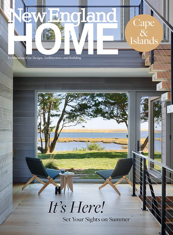
This article originally appeared in the 2017 issue of New England Home Cape & Islands with the headline Cottage Chic.
Share
![NEH-Logo_Black[1] NEH-Logo_Black[1]](https://b2915716.smushcdn.com/2915716/wp-content/uploads/2022/08/NEH-Logo_Black1-300x162.jpg?lossy=1&strip=1&webp=1)






You must be logged in to post a comment.