A Tree Grows in Brookline
September 14, 2016
Family ties, an affinity for the classics, an eye for detail—and a natural wonder—come together to inspire a standout Boston-area home.
Text by Maria LaPiana Photography by Michael Partenio Produced by Stacy Kunstel

For David and Stephanie D’Angelo, family was the inspiration for this house: the present needs of their family of five as well as the couple’s future needs, as they intended to grow old there. For the architect, inspiration came from an unusually narrow lot and an inclination toward compelling, classic designs. For the interior designer, inspiration was sparked by a required melding of styles and a simple, sophisticated palette. For the landscape architect, it was the tree. As nature would have it, the tree—a century-old American beech—held sway over the rest.
When the D’Angelos found an acre on a venerable street in Brookline, Massachusetts, they called on Boston architect John I. Meyer. He in turn called on a longtime collaborator, Boston landscape architect William Pressley, to take a look at the site. “It was nothing special,” Pressley says he thought at the time. “A plain raised ranch sat on the lot, with a big old tree in the back.”
The next time he visited the site the house was gone—and the old tree seemed bigger, more meaningful. “I told John, ‘Why don’t we save that tree?’ . . . although it seemed like the most impossible thing to do,” he remembers.
The tree turned out to be what David calls “the most important element of designing the home. The house and the patio sort of wrap around the tree and the effect is pretty special.”
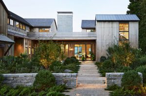
Says Meyer, “It’s on one of the nicest streets in Greater Boston, but part of the site is really narrow.” Because the house had to sit sideways on the lot, it couldn’t have a conventional elevation—at least not until Meyer designed one with a hole in the middle of it. The tree in all its glory is visible through the keyhole in the facade.
Meyer channeled the work of renowned architect H.H. Richardson in designing the home’s exterior. With the lavish use of masonry and stone, rounded arches, intricate details, and a sense of permanence, he paid homage to the Romanesque Revival style for which Richardson is known. A stately silhouette, grand doors and windows, and an abundance of fine materials (stone, slate, copper, and more) contribute materials,” says Meyer. “We changed tones, darkened trim, we kept focusing until we had it. And only then did we get our very gifted craftsmen involved.”
The front door is nestled underneath the stone arch, providing a sheltered welcome into a home that is as sophisticated as it is comfortable. Interior designer Maureen Griffin Balsbaugh had worked with the family on two previous projects, but admits she was “blown away” when she saw these drawings. “The plans were so detailed I knew I had to let it play out in my head.”
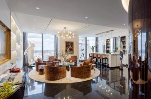
She and Stephanie share a design aesthetic (they even showed up in the same outfit at an early meeting). “She wanted modern—but the softer side of modern. A delicious mix of modern and elegant,” remembers Griffin Balsbaugh. The palette would be monochromatic, a combination of silvers and grays and whites, with the palest hint of blush. In a way, that helped to define everything that came later.
The general look is one of classic styling with modern overtones and a few glam notes. The designer and homeowners chose all of the hard materials—from floors to countertops—that complemented Meyer’s classic vision, and almost all new furnishings. They to linens. And there are lots of lovely, curvaceous silhouettes. Also, says Griffin Balsbaugh, “It was very important that, despite the home’s presumed pedigree, it had to look like it was done now.”
Meanwhile, Pressley was developing a landscape plan that would give this special home the surroundings it deserved. “You work with what you’ve got to work with,” he says. “I knew we had a lot of stonework on the house, so whatever we did had to fit in with that vocabulary.” The first thing he did was erase the word line from his own vocabulary. “I just don’t see a lot of straight lines, ever,” he says.
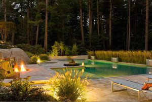
The evidence is everywhere, in the hardscape as well as the plantings. For visual interest, the land scape plan includes lots of color, “and not just for two weeks out of the year,” Pressley says. The rolled stone driveway had to be wide (they settled on twenty feet); it’s unusual, he says, but it works. There’s a terrace overlooking the pool area, and a long bench that curves around the now-celebrated tree. The foundation supports were crafted to protect the tree’s root system—and up-lighting contributes added drama.
To truly understand this house you have to “go there and look at it, and walk through the site,” says Meyer. “Then walk through the plan. There are really magical things all around. It’s spatially surprising and interesting, without being glitzy.”
About that tree: “It simply wouldn’t have survived if we’d decided to build a regular, fat house,” says Meyer. “Now the magnificent tree is going to live another 200 years.” •
Architecture: John I. Meyer, Meyer & Meyer Architects
Interior design: Maureen Griffin Balsbaugh, Griffin Balsbaugh Interiors
Builder: Marc Kaplan, Sanford Custom Builders
Landscape design: William Pressley, Pressley Associates
Share
![NEH-Logo_Black[1] NEH-Logo_Black[1]](https://b2915716.smushcdn.com/2915716/wp-content/uploads/2022/08/NEH-Logo_Black1-300x162.jpg?lossy=1&strip=1&webp=1)


You must be logged in to post a comment.