Modern Match
May 21, 2010
Text by Megan Fulweiler Photography by John W. Hession
The New Hampshire seacoast is as picturesque as it comes. All the classic postcard requisites appear: bobbing boats, white steeples, lovely old houses. The owners of this new home used to live in one of those old houses, a handsome Federal-style abode. With kids grown, though, a simplified aesthetic beckoned.
Originally, this site with its spectacular views held an aging rental property—the last house tottering at the end of a quiet street. Over time, as is so often the case, the place had been chopped into multiple units. Rather than waste funds trying to prop up the old building, the couple chose to raze the house and build an energy-efficient home that would be hospitable to the pretty surroundings.
Following their inclination, they decided on a clean contemporary plan that would both respect their neighbors’ homes and engage the landscape. Determined to arrive at the best scheme possible, the pair staged a competition and invited three area architects to participate. “That’s how we got the job,” explains architect Aileen C. Graf, principal along with husband Michael of Graf Architects, in Newburyport, Massachusetts. “It was all very exciting.”
It’s no surprise the Grafs’ firm won. Looking to the sloping site for inspiration, the team contrived an ingenuous three-level home. “It’s on a point of land, so water is all about. We wanted to maximize that as much as we could,” Aileen says.
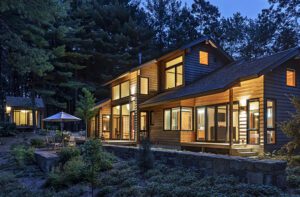
Tucked into the green hill, the south-facing house seems—like one of the many birds that call the shore home—to have found the ideal nest. Rather than fight the topography, the environmentally friendly design embraces the variations. Natural materials, such as stone from a nearby quarry and cedar siding, play to the New England vernacular and boost the sense that house and site were meant for each other. The siding may reference traditional clapboard, but the flush installation is modern. Decks are made of stone (a concealed drainage system funnels away rain) to strengthen the indoor-outdoor connection and rooms angle to best catch the ever-changing panorama of water and sky.
Portsmouth, New Hampshire, landscape architect Terrence Parker, of TerraFirma Landscape Architecture, concocted a stone stairway that leads from the street up to the entry. “The door sits ten and a half feet above grade, and the path needed to meander across a ledge,” Parker says. “It’s unique.”
Visitors arrive at a handsome but modest entry at the second level. Only once inside is the true volume of the house felt. With walls finished in Venetian plaster by Tom Schulz of Ennis Art, North Carolina, the foyer offers a heady bit of drama. Their rich, waxy sheen seems to set the light in motion much as the surface of water does.
From the foyer, a short curving wall marks a path to the core of the house—living and dining areas and kitchen. The spacious lower level contains, in addition to the garage at one end, a sauna, a family room, two bedrooms for visiting children and guests and a bath. More Venetian plaster and a European open-style shower in the latter are in sync with the energy unfolding above.
Yet no matter what level you’re on, the minimal decor and serene, earthy palette keep the focus squarely on the architecture and Mother Nature. With so much glass, it’s easy to forget the boundaries that separate the inside and outside worlds. The decks increase the living space and enhance the options for relaxation or entertaining. The west deck, in fact, is equipped with a beauty of a stone fireplace. “They use this one all the time,” says Aileen. “It’s a perfect spot for evening cocktails.”
The west deck’s hearth backs up to the living room fireplace. On the indoor side, Aileen and Michael installed an elegant surround of concrete panels. The steely gray of the concrete is a stunning foil to pale-blond bamboo floors. Although ceilings climb a generous ten feet, ambient heat and high-energy windows thwart the coldest winters.
Cocktails should be mixed in the soft light of early evening, while early birds will be rewarded with a bright sunrise to complement their morning coffee. That’s why the insightful team parked the kitchen on the east side of the house. When those morning people take a seat at the kitchen island for their coffee, it’s no ordinary perch. The concrete island—devised with help from Schulz, who handled all concrete work throughout the home—curves, protecting the cook’s classic triangle of stove, sink and fridge on one side while gently moving traffic along toward the outdoors on the other. “We made several small-scale models till we achieved the right one,” Aileen says.
The island’s tiered profile allows family and friends to pull up stools and kibitz with the chef but, at the same time, conceals messy dishes and pots. A light well is a surprise; cut deep into the island’s end, it interjects a slice of warmth to the kitchen’s cool mix of materials.
A granite-topped bar claims the uncluttered kitchen’s north wall. A second sink here means that two or three activities can run smoothly at once, accommodating any number of people.
Custom cabinet-maker Andrew Colby, of South Berwick, Maine, crafted the streamlined cabinetry. Its maple veneer is stained a sea-like weathered gray. A multitude of drawers and cupboards make for bountiful storage, but are tucked and tailored to keep the ambience blessedly airy.
Bamboo stairs guarded by a sleek powder-coated-steel railing wind their way to the top level. This sunny floor, with its curved ceiling mimicking the profile of the roof, is the homeowners’ own retreat. Up here, windows look out on three sides, catching birds in flight and streaming ribbons of cloud. Snowfalls are a magical treat.
“I never miss our old house,” the wife admits, not surprisingly. “Where we are now in life, it seemed ridiculous to have fourteen rooms and live in three.”
And, really, who could miss the past, with such a master bath? From the porcelain-tiled floor to the tub’s concrete surround, the design is sophisticated and functional. Italian fixtures and sculptural Wenge-wood sinks give the couple’s everyday grooming a ceremonial tone.
“We always liked this property, we just never thought we’d be here,” says the wife.
That ends this fine project on an even happier note. It’s as if destiny came along to ensure that the house and the family that loves it ended up exactly where they were meant to be.
Architecture: Aileen C. Graf and Michael Graf
Landscape architecture: Terrence Parker, TerraFirma Landscape Architecture
Builder: Dan Willett, Wood Wright
Share
![NEH-Logo_Black[1] NEH-Logo_Black[1]](https://b2915716.smushcdn.com/2915716/wp-content/uploads/2022/08/NEH-Logo_Black1-300x162.jpg?lossy=1&strip=1&webp=1)








You must be logged in to post a comment.