Coming Home
May 26, 2016
A modern update to a classic Shingle-style house in an archetypal New England town gives a couple and their two children a new sense of belonging.
Text by Lisa E. Harrison Photography by Michael Partenio Produced by Stacy Kunstel
When it comes to house hunting, the list of must-haves varies greatly. Some people want waterfront. Others need six bedrooms or an easy commute to the city. Hilary Breier’s top priority was belonging to a nice community. With two young children and a husband who frequently travels internationally, she felt a bit isolated in the family’s home on the Wilton/Ridgefield border. When she came across a Shingle-style house in Southport while her husband, Damien, was out of the country, she asked a friend—a Yale architecture major who also happened to be a teaching assistant for a professor who penned a book on Shingle-style homes—to accompany her on the tour.
His verdict was swift: “If you guys don’t buy this house, I am buying this house.” And it spurred Hilary to act quickly: she put an offer on the house before Damien even had a chance to see it.
In fact, Damien wouldn’t step foot on the property until the day of the inspections. It was 9 a.m., Hilary remembers. As they strolled the backyard, the bells of Trinity Church began to ring, and cherry blossoms fell gently from the trees. It was all too perfect. Damien turned to her and asked, “Did you set this up?”
The setting and the community were ideal; Southport is a quintessential New England waterfront village. A library, a beach, and a yacht club are all easily reached by kids on foot or bike. It’s the kind of place where you might bump into your architect or interior designer at church on Sunday morning.
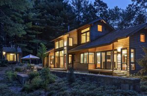
The house, on the other hand, needed some work. Southport architect John Franzen says that other than paint, appliances, and some minor updates here and there, the house hadn’t been altered since it was built in 1894. In fact, because it sits squarely in the Historic District, change doesn’t come easily.
The original house had a very small kitchen, remembers Franzen, and a chimney stood in the way of expansion. Removing a chimney is a no-go in a Historic District, so Franzen worked around the problem by installing a steel beam to support the chimney while he did away with the fireplace. This paved the way for him to bump out the kitchen and add a family room, bathroom, and mudroom. He reconfigured the second floor, converting smaller rooms into a master suite and two good-size bedrooms for the kids. Save for an updated bathroom, he left the third floor intact.
The plan also called for adding a two-car garage, a pool house, and a pool. Landscape architect Allison Slaughter surrounded the pool with lush grasses and perennials. In the front of the house, classics ike flowering trees, hedges, and hydrangeas suit the residence beautifully.
Hilary found her interior designer a bit serendipitously. A nonprofit fund-raising meeting brought her to Parker Rogers’s home. As soon as she saw his house, she said to herself, “I found our designer. I want our house to look just like Parker’s.” He had achieved what she wanted: a timeless New England look that integrates a nice mix of classic and contemporary pieces but is, above all, comfortable.
Rogers and his associate, Katie Holmberg, set to work. “We wanted to pay homage to the history of the house, town, and architecture, but keep it fresh and livable for a young family,” Rogers explains.
The family room makes a perfect illustration of this notion of mixing new with old. Hilary and Damien had a favorite carpet from their previous home that they wanted to incorporate. The designers used it as a launching pad, pulling its navy and cream to create a casual coastal vibe. To add texture, they covered the walls in grasscloth and hung bamboo blinds on the two big banks of windows.
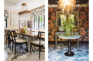
For continuity, the grasscloth continues into the adjacent kitchen, which stands two steps up from the family room. Characterized by traditional white Shaker cabinets, Carrara marble countertops, and a backsplash of white subway tile, the space is defined by clean lines and a user-friendly layout. The spacious new kitchen also has a pantry, a built-in coffee station, and a round table that seats six for casual dining.
An overarching theme was to “deformalize the house and open it up,” says Holmberg. The designers set that vibe right from the get-go in the front foyer with an antique marble-top French sideboard that does double duty as a bar. “We like to put bars in a lot of our rooms,” explains Rogers. “It says welcome to our house, have a drink, relax.”
The fun continues in the billiard room, which is just to the right of the foyer. The table, an antique from 1907, was a wedding gift. The designers spruced it up by changing the felt and finish and adding new leather pockets. To give the room a real gentleman’s feel, they chose a chocolate-brown crocodile-textured wallpaper—“everyone reaches out and touches it,” says Holmberg—and a Ralph Lauren masculine plaid for the drapes.
A touch of green in the drapes and seagrass area rugs throughout bring harmony to the billiard, dining, and living rooms. Continuity was important, notes Holmberg, because the rooms are visible from one another.
The living and dining rooms have a more formal appeal, yet still feel comfortable. Luxurious fabrics and furnishings create a nice interplay with the textured rug. A decorative painter transformed the dining room’s white built-in cabinet, giving it the look of a beautiful antique piece of furniture. Hand-carved custom chairs from London flank the dining table, but “to keep the house fresh, crisp, and young,” says Rogers, the designers went bold with an apple-green mohair upholstery. And the pièce de résistance? An intricate, hand-blocked William Morris wallpaper, a nod to the nearby Pequot Library.
The stunning wallpaper is, in a way, emblematic of the whole project—it’s a renovation that is sensitive to a particular time and place, beautifully merging past and present. And most important to Hilary, it celebrates the community she and her family have grown to love. •
Architecture: John Franzen, J.P. Franzen Associates Architects
Interior design: Parker Rogers and Katie Holmberg, Parker & Company
Builder: Construction and Development Management Associates
Landscape architect: Allison Slaughter
Share
![NEH-Logo_Black[1] NEH-Logo_Black[1]](https://b2915716.smushcdn.com/2915716/wp-content/uploads/2022/08/NEH-Logo_Black1-300x162.jpg?lossy=1&strip=1&webp=1)







You must be logged in to post a comment.