Design In Depth: Tony Cappoli
February 23, 2016
Text by Paula M. Bodah
If we could use just one word to describe Tony Cappoli’s signature look, it would have to be glamorous. Of course, like all the best designers, Tony’s work reflects his clients, not himself. Still, whether he’s designing is an urban apartment or a sprawling suburban mansion, whether his clients tend toward the formal or casual, neutral or colorful, Tony always makes sure every room has a timeless, effortlessly elegant look and feel.
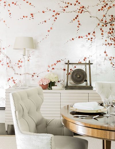
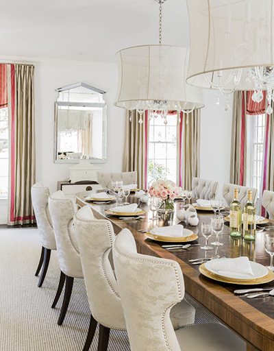
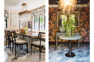
Take the Amherst, New Hampshire, home we featured in our November-December 2015 issue. Desi and Greg Wakeham didn’t want a home that was typically anything—not super-traditional, not overtly contemporary, not stuffily formal, but not kick-your-feet-off casual either. The expansive (28 feet by 18 feet) dining room has 10-foot-high ceilings and deep moldings, giving it a stately, gracious air. Tony played off the room’s inherent formality by painting the walls and trim white. He created a focal point along one wall by mounting a screen covered with a stunning de Gournay wallpaper depicting cherry blossoms against a silvery background. The wallpaper and the gleaming walnut burl dining table read as formal, while the carpeting and the klismos-style chairs with their Asian-inspired fabric sound a contemporary note.
Desi Wakeham wanted statement-making crystal chandeliers, but Tony thought the classically ornate pieces she favored would be too predictable. “They were gorgeous, but you expect a crystal chandelier; I wanted to have an element of surprise.” He brought the chandeliers to Blanche P. Field, where he had many of the crystals taken off (“I thought the people at Blanche Field were going to kill me!” he says) and had sheer shades in a modified drum style put on. In the end, the room, like Tony’s clients, defies being labeled with a particular style. It’s sophisticated, and—yes—glamorous, but still warm, inviting, and comfortable.
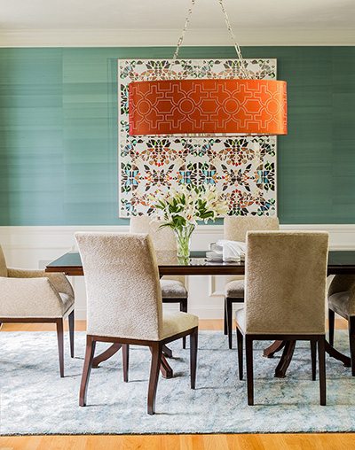
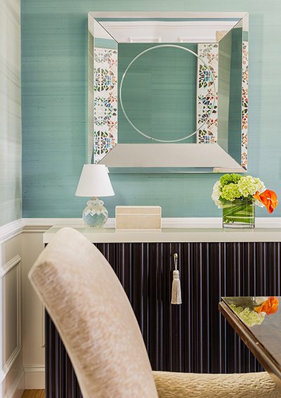
The dining room in a Boston-area house Tony recently completed looks clean, uncluttered, and totally sophisticated. Do not be lulled into thinking such simple elegance comes easily, however. The overriding element here is texture, Tony explains. The softness, sheen, and movement in the silk rug are echoed in the hand-dyed silk Donghia wallcovering, both a luscious shade of teal. Tony chose a straightforward pedestal dining table then surrounded it with Art Deco-influenced chairs covered in a fabric whose cut-and-loop texture creates a small-scale pattern that’s “very sophisticated, very subtle,” Tony says. A Laura Kirar buffet finished in a combination of lacquer and wood complements the mahogany dining table without being too predictably matched. “The pièce de résistance is the chandelier,” says Tony. The Michelle Hatch fixture has an almond-shaped drum shade in an eye-catching orange. “The husband was like, ‘Orange? Are you nuts?’” Tony says with a laugh. “There are touches of orange throughout the house, so I wanted to bring it in here, too. It makes such a statement.” Making the chandelier truly spectacular are the thousands of Swarovski crystals that decorate the shade. “It’s the room’s crowning jewel,” Tony says. As the designer explains it, he used a number of variations on similar textures to achieve the room’s look. “It looks very simple, but you take more of a risk when you use things that are alike,” he says. “You can fall flat on your face, or it’s going to be stunning.” We’d say this comes down on the stunning side.
And now for something completely different: Tony’s own loft in South Boston’s Channel Center, featured in our March – April 2010 issue. There is no denying that this is a sleek, thoroughly modern home. No intricate moldings tuck between ceiling and walls, no crystal chandelier hangs overhead. The palette of white, chocolate brown, and vivid orange is hardly traditional. Yet, like the two dining rooms above, the space uses timeless elements, such as an iconic Arne Jacobson Egg chair and the Barcelona chairs, and an emphasis on color and texture to create a personality-filled, welcoming living room. The dozens of beveled mirrors hanging behind the sofa add the touch of glamour we’ve come to expect from this talented designer.
Share
![NEH-Logo_Black[1] NEH-Logo_Black[1]](https://b2915716.smushcdn.com/2915716/wp-content/uploads/2022/08/NEH-Logo_Black1-300x162.jpg?lossy=1&strip=1&webp=1)






You must be logged in to post a comment.