Jill Goldberg on Scene-Setting Foyer Design
November 20, 2015
Text by Paula M. Bodah
No question, the foyer sets the tone for the home. When a front door opens, visitors get an immediate sense of what sort of person dwells within. The entry gives the first glimpse into the tastes, personalities, and priorities of the homeowners.
When Jill Goldberg, founder and principal of Hudson Interior Designs, works with a homeowner, she strives to create a home that’s true to her client’s sensibilities, starting right at the front door. In the case of a suburban Boston couple, as we showed in our September-October issue, that meant taking a house with a lot of traditional elements and giving it the lively, colorful personality of its young family. Here, Jill talks about how she set the tone in this house and two other suburban Boston homes.
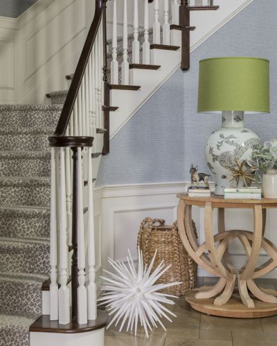
“When you enter this ‘Colorful Traditional’ home you can immediately expect that the family that lives here is fun and exciting,” Jill says. “When the homeowners purchased this house they inherited rooms that had been professionally decorated in what can only be described as ‘modern Gothic,’ with dark tones, heavy textiles, and weighty rugs. This is not what the new homeowners had in mind.
Photograph by Michael J. Lee
This family is not afraid to live out loud! They see the fun and joy in everything around them and they wanted their home’s interiors to be reflective of this approach to life. In a project whose scope included designing every room in the house, they asked me to ‘brighten it up!’ I was guided by color and pattern. The entire home was treated to a new color scheme, new window treatments, new rugs, and new furniture.
The highlights of the entrance foyer include the animal-patterned stair runner, the subdued yet noticeable green lamp shade against the pastel blue wall, and the outrageous iconic sculptural element on the floor which is scaled to compliment the table and woven basket and offer a textural contrast.”
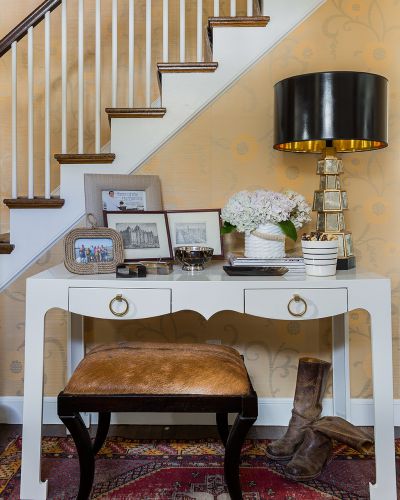
“A young couple purchased this ‘Wellesley Colonial’ home and faced the challenge of creating a decor reflective of their tastes while integrating significant pieces of furniture handed down from their families as well as pieces that came with the purchase of the house,” Jill explains. “I sized up the new homeowners’ interest in preppy, added punches of color, and created an approach to working with the inherited furnishings by adding a little dose of excitement.
Photograph by Michael J. Lee
This couple has eclectic tastes, with an elegant bent. My goals was to create a cohesive, complimentary blend and to suggest comfort with panache. This entrance foyer is a vignette of what you experience throughout the other rooms of the house.”
My approach with the existing furniture was to select new fabric; the goat-hide bench is a great example. The curves of the legs on the bench create visual unity with the curves of the underside of the table, but each maintains its identity, thanks to the difference in their finishes.
What to do with existing wallpaper when the client does not want to remove it? Decorate to its strengths and create a visual distraction. Once I found the antiqued mirrored lamp with high-gloss black shade, the entire grouping came together. The lamp is the right height, has a pleasing subtlety, and draws your eye to the grouping so that you notice the small framed pictures and accessories that speak to the personal life of this family. I wanted the first glimpse of the house’s decor to convey this family’s sense of adventure.”
“My clients had finished a major structural renovation on this older ‘Wellesley Estate’ home, striving to keep what they could of the original,” Jill says. “I was asked to contribute new interior decor, including furnishings, accessories, draperies, and color schemes, to the dining room, sitting room, office, entrance foyer and master bedroom. My intention was to create a classic style while not feeling confined by a traditional approach.

Photograph by Nat Rea
This entrance foyer conveys to the visitor that the family is tailored and elegant. It is all about the clean lines and purposeful placement of the furniture and the accessories.
I updated the entry walls with Schumacher’s Imperial Trellis in cream on cream to enhance the effect of natural sunlight. The paint color helps add a modern aesthetic to the traditional lines of the wood millwork. The classic demilune and brown gourd lamp say it all. No need for other accessories, because the beautiful wood floor planks and architecture of the narrow space become part of the visual interest.”
Share
![NEH-Logo_Black[1] NEH-Logo_Black[1]](https://nehomemag.com/wp-content/uploads/2022/08/NEH-Logo_Black1-300x162.jpg)


