Future Perfect
April 28, 2014
A top-to-bottom renovation proves that living in a fine old Boston brownstone doesn’t have to mean dwelling in the past
Text by Erin Marvin Photography by Michael Partenio Produced by Stacy Kunstel
They say that history repeats itself and that adage certainly rings true in the renovation of this Boston brownstone. Built as a single-family home in the latter half of the nineteenth century but divided into multiple units decades later, the building shared a past similar to many of its Back Bay neighbors—until new owners decided to give the house a future all its own.
Ken and Heliana moved to Boston by way of Rio de Janeiro, bringing along twin children, a modern design aesthetic, and experience with two previous house renovations. They’d spent almost a year looking for a new place to call home in the Hub when they were seduced by the good bones, elegant allure, and central location of this Back Bay charmer. “We bought the house primarily based on a first impression that it was unusually beautiful in terms of design details, inside and out,” says Ken.
They wanted to return the building to its original role as a single-family home, restoring a cohesive feel to the structure, but with a layout more suited to the needs of a modern-day family. They also wanted to install an elevator accessible to every level of the house. To help them accomplish these lofty goals they enlisted architect Andrew Reck of Weston, Massachusetts–based Oak Hill Architects and Boston interior designer Meichi Peng. “It was a whole-house project, literally from top to bottom,” says Reck. “Even though the entire house wasn’t gutted, every room was affected. There was a tremendous amount of reconfiguring, but the whole point was for it to look like it’s always been there.”
Although the home’s traditional detailing was a departure from the couple’s love of modern design, they respected the building’s history and wanted to strike a fine balance between its past and their own present. “There were certain legacy aspects to the home that we knew we didn’t want to get rid of or change,” says Ken. “In fact, we went to great pains to reproduce some of the wainscoting and molding throughout the house. It’s hard to tell what’s been there for many years and what’s been matched perfectly by the woodworkers.”
“The detailing was very important because we wanted it to continue throughout the house and feel complete,” adds Reck. The trick—one at which he and his team clearly succeeded—was to let the millwork and other interior details, such as decorative plaster rosettes, frosted glass, and lead caning, pay homage to the building’s history without precluding the home from having an overall modern feel.
Peng and the homeowners brought that same attention to detail to the furnishings, opting for clean-lined furniture and neutral hues. “The house feels very fresh and lightweight,” says Peng. “We kept the color palette simple and subdued because we wanted to let the architectural details shine through.”
“Involving Meichi early in the project assured us that the look and feel of the house would be uniform and the floors, walls, and fixtures would be complemented by the furnishings we had in mind,” says Ken.
Changes big and small contributed to the transformation from condo building to comfortable home, including relocating two bathrooms, the kitchen pantry, and the master closet to make room for the new elevator, as well as turning a onetime coal-storage area into a wine cellar and creating an expansive roof deck.
The home now welcomes family and friends at the parlor level, which features a spacious entry, formal parlor, powder room, and home office. “Back in the 1800s, this was the main entertaining level, and we returned it to that function,” explains Reck.
A skylight floods this floor and the three above it with copious amounts of natural light, enhanced further by a second skylight through the top three levels. “We maximized how light comes in and how it travels through the house,” says Reck. “For an urban townhouse it’s extremely bright.”
From the parlor level, a grand staircase (one of three in the home carefully reconfigured and restored by Oak Hill Architects) leads up to the family’s main living areas.
The floor above the parlor has an open, airy layout. A piano in the comfortable but chic living room sees plenty of use from this family of music lovers (Ken, Heliana, and their children all play). Opposite the piano, a large painting over the fireplace keeps the space balanced. In some rooms, such as this one, Peng worked with artwork and furniture the homeowners brought with them, tying old and new together with area rugs, draperies, and light fixtures.
Across a wide hall sit the kitchen and dining room, as well as a small back patio where the family often enjoys breakfast in the morning sunshine of a summer day. The smallish kitchen was one of the initial pain points for the homeowners when they were considering the house. “It was a beautiful kitchen but had a few angles that were wrong,” recalls Ken. “The fridge didn’t open all the way; the stove was small. We found ways with Andrew to maximize the space by moving columns, adding fridge drawers, putting in a six-burner stove—little details that made the kitchen functional.”
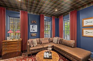
The top two floors house the family’s private spaces. Occupying one level are a stylish master suite and a media room, the latter of which is a lush departure from the home’s otherwise cool palette. A red-wine-hued rug the owners already had sets the tone for this space, where the family gathers to watch films on a large projection screen while sinking into the comfortable steel-colored sectional. When it’s time to start the movie, heavy velvet drapes block the light from three large windows. The entire room, including millwork and window casings, is coated in a luxurious graphite color that has an underlying purple tone. “We wanted to make everything else disappear and address the richness of the carpet,” explains Peng. Plush pillows and sleek lacquer trays mimic the carpet’s deep-red color and add lightness to the cozy room. After the credits roll, the twins can retire upstairs to their own bedrooms.
From the bright garden level—once a dark space the family rarely ventured into but now an oft-used music room and guest suite—to the expansive roof deck, the revitalized building promises a bright future for the family that now calls it home.
Architecture: Andrew Reck, Oak Hill Architects
Interior Design: Meichi Peng, Meichi Peng Design Studio
Builder: Connaughton Construction
Share
![NEH-Logo_Black[1] NEH-Logo_Black[1]](https://b2915716.smushcdn.com/2915716/wp-content/uploads/2022/08/NEH-Logo_Black1-300x162.jpg?lossy=1&strip=1&webp=1)


You must be logged in to post a comment.