Brandon Smith: West by Northeast
September 10, 2013
Being a Californian, a Southern Californian no less, I’m all too well versed in what the public perceives to be our beach style. It should come as a great surprise to many that what we may wear to a coastal outing, the bright fluorescent colors and iconoclastic themes of 1960s pop so popular on the sand in Huntington Beach or Venice, home to surfers hanging loose, falls so far from the hues in which we’ve come to live.
Photos by Brandon Smith
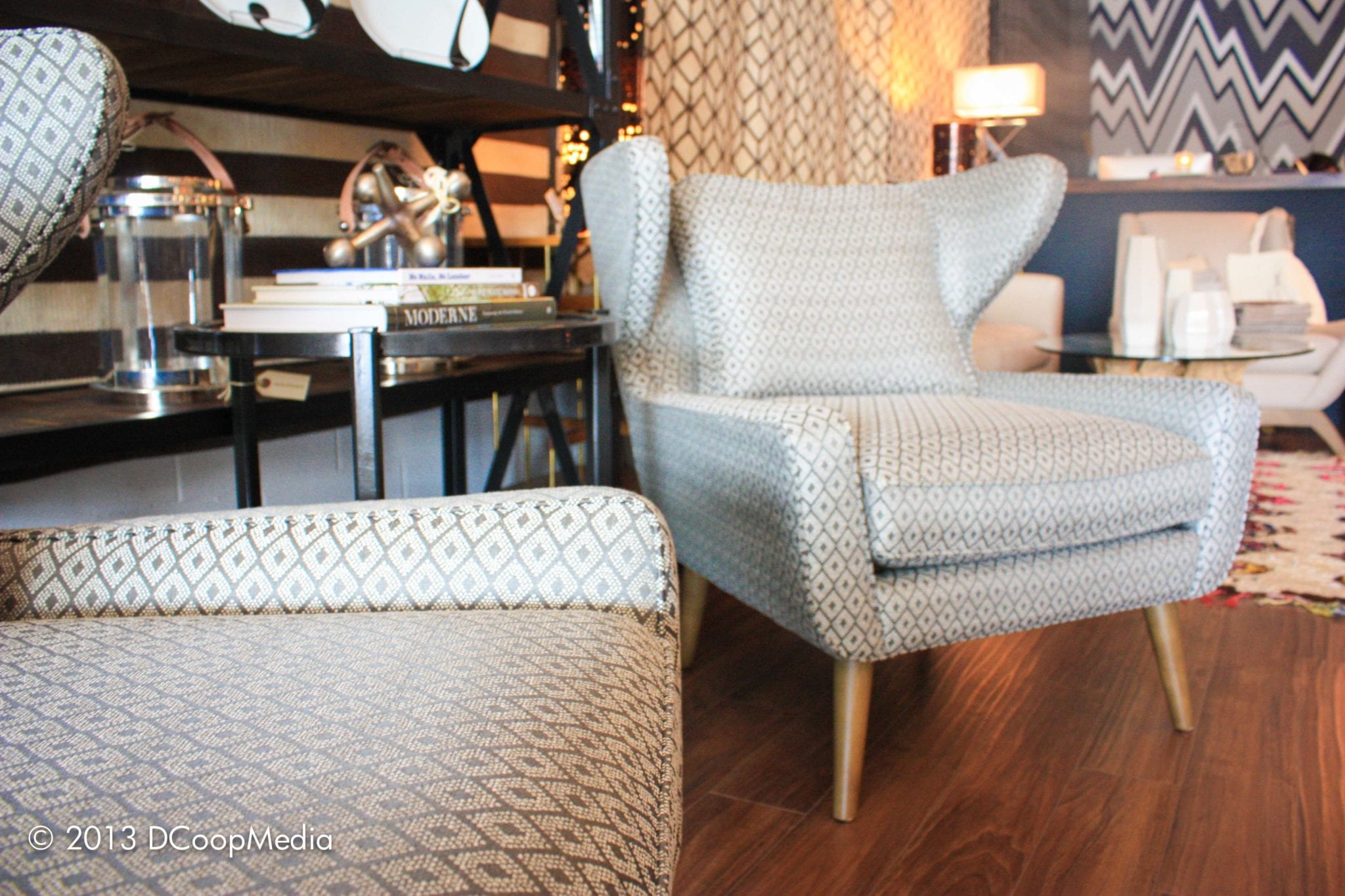
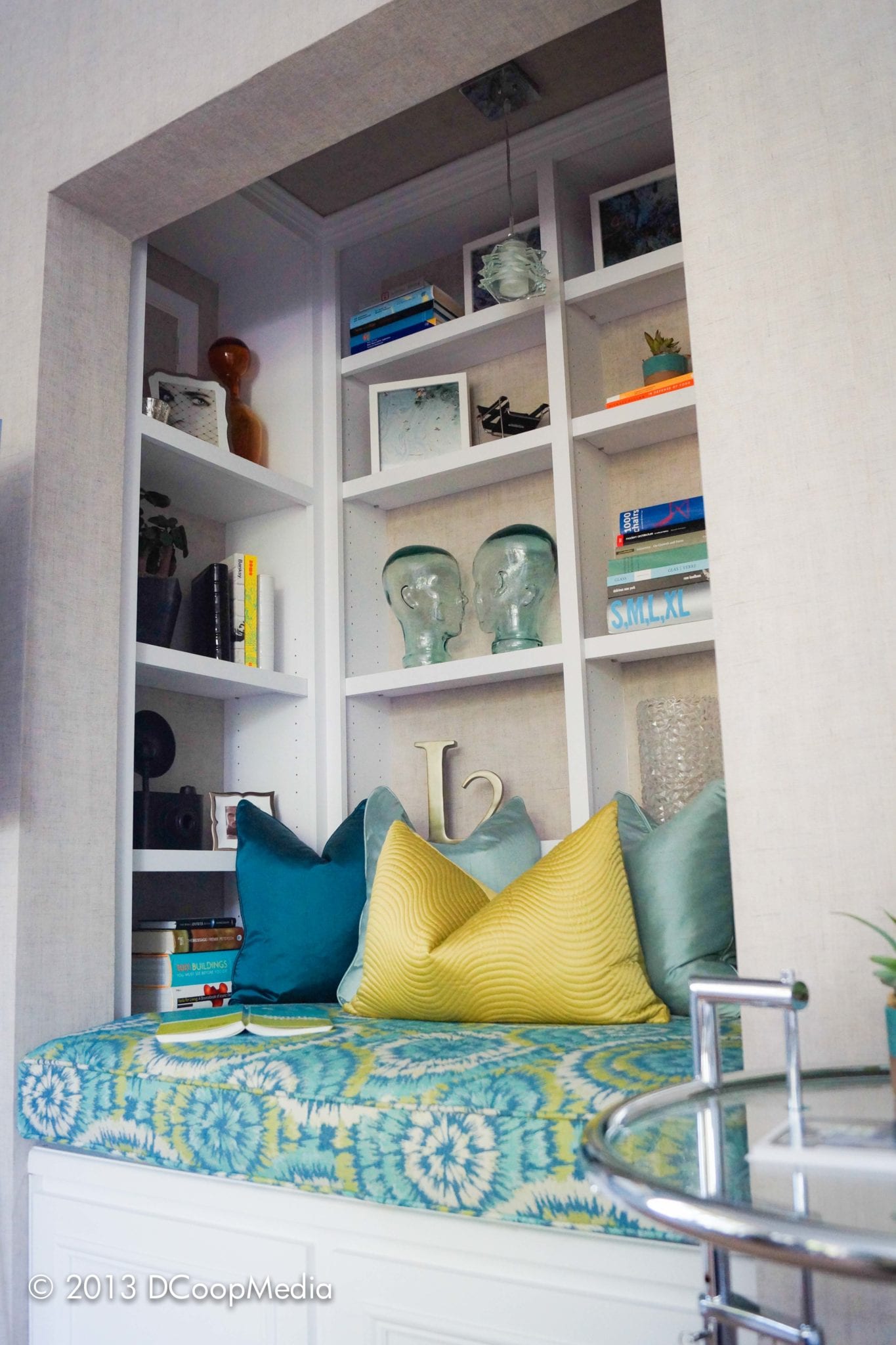
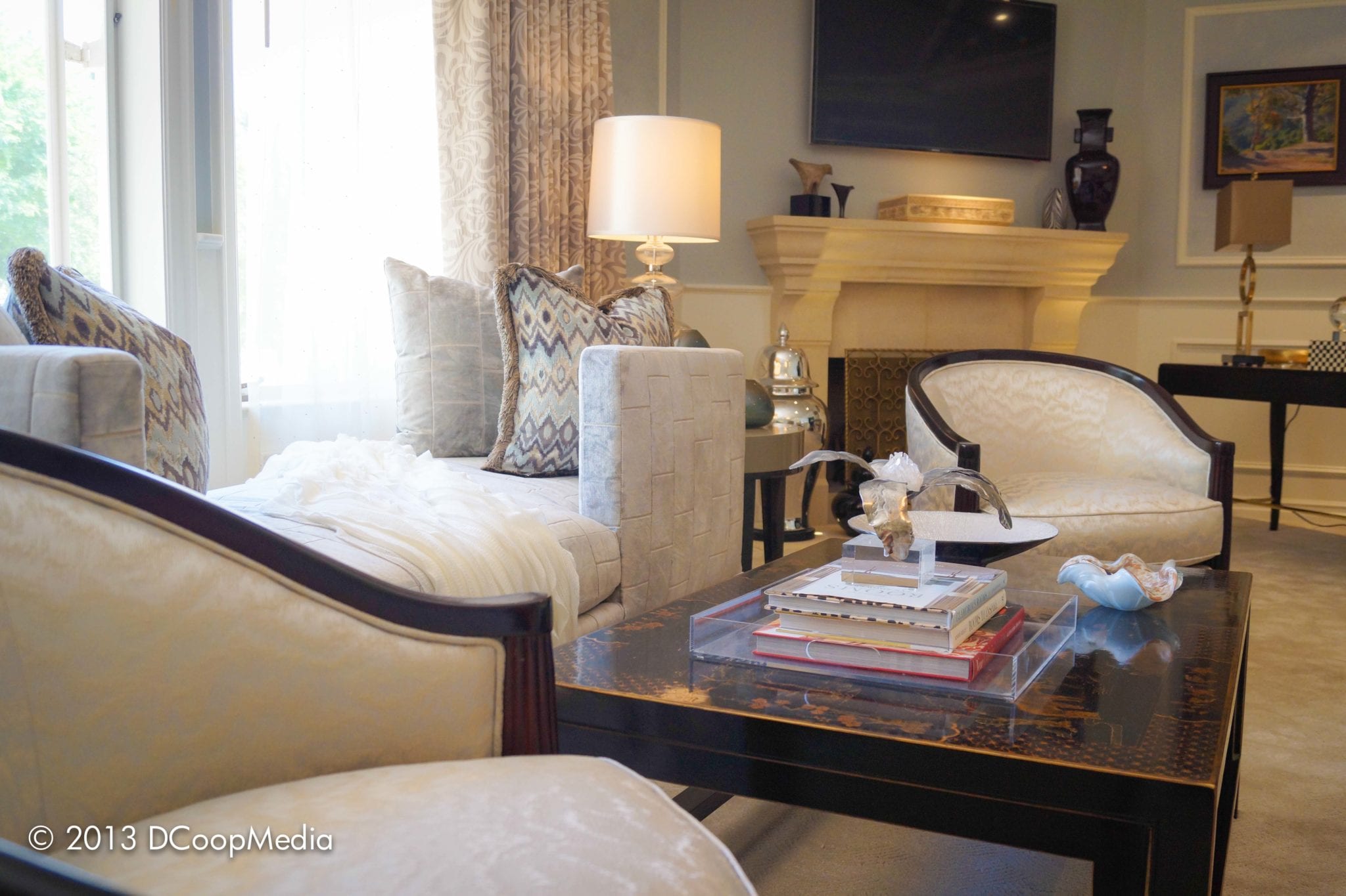
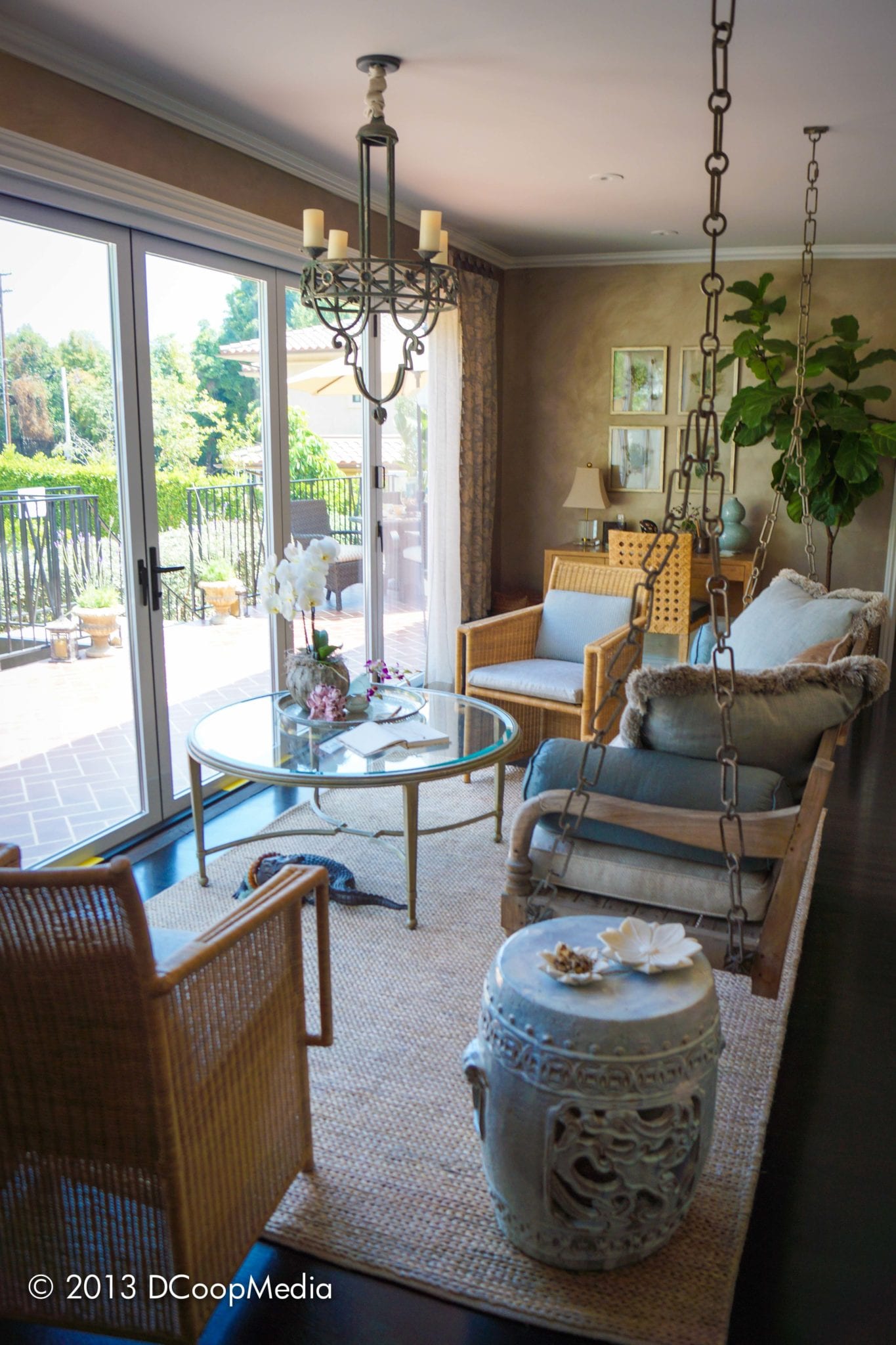
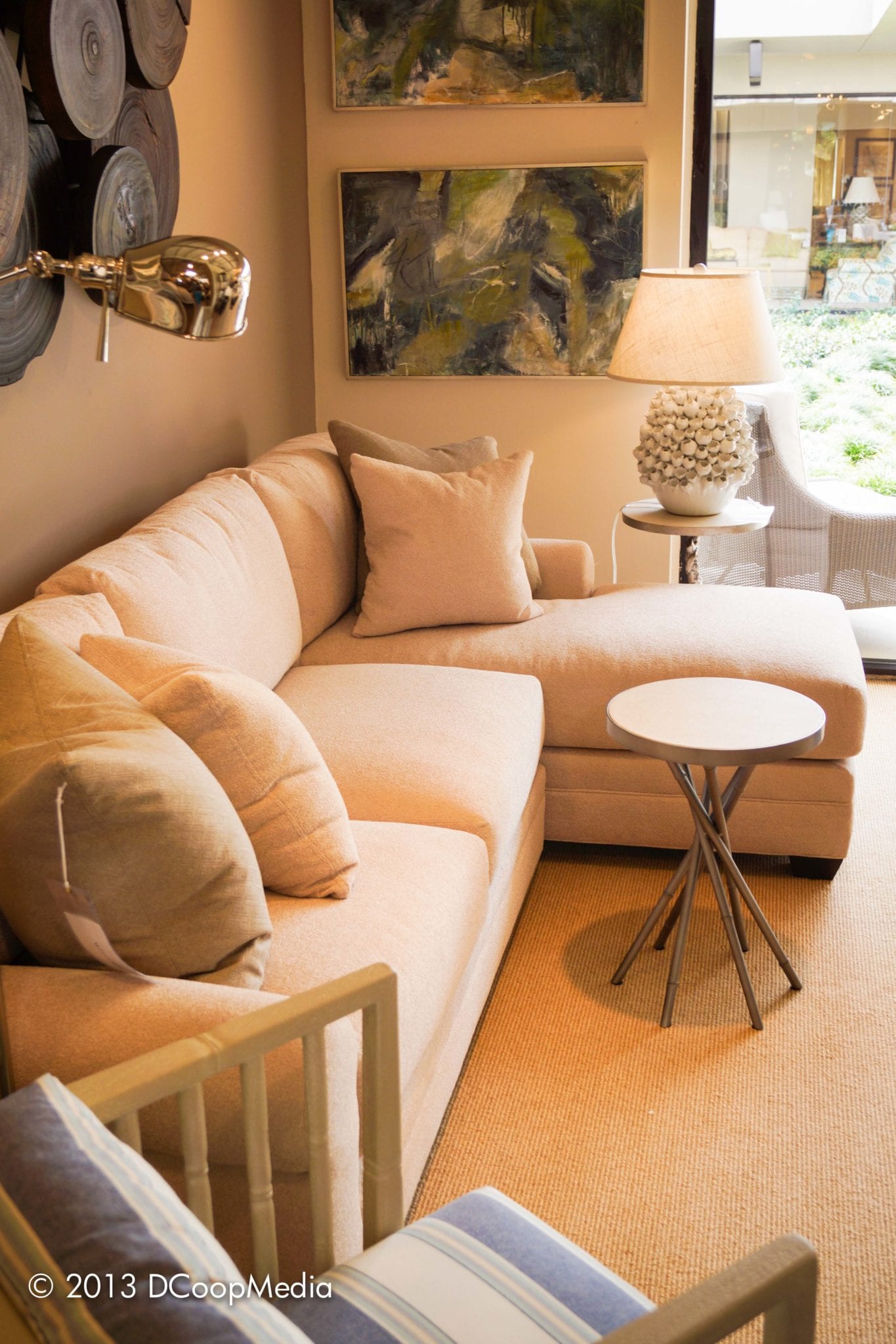
I find it interesting that out of doors, we cling to bright tones and the thematic of the Endless Summer. But the moment one steps inside, a new sense of relaxation and calm overtakes our overtly sunny disposition. Brilliant blues fade to washed grays. Oranges and reds recede to pink. Deep greens become the soft tonality of sage and seafoam. The energies of the coastline take a proverbial break.
There is a part of me, especially as we enjoy the last few days of an extended summer, that believes it may come down to our ample sunshine. I’m not trying to rub it in, I swear. Our hemp wearing, oatmeal eating selves have let our possessions fade and instead of fretting, we’ve thrown our arms into the wind and let it be.
It’s cool. We’re ok with sun washed and faded. We are the ones that created Levi’s jeans and more so, we made faded denim popular. For that, I should probably apologize for the 1980s. I’m sorry.
Though I can’t guarantee it won’t happen again.
The end result, however, is an eschewed sense of casual. It’s an invitation to, after a hard day pounding the waves, to come in, throw one’s bare feet onto the coffee table, and sit. At least until it’s time to get back on our boards and paddle into the storm, that is. It’s collected. It’s effortless. And it’s a quiet sensitivity that we’ve come to enjoy on the west coast.
But our friends to the Northeast. Therein lies a tale in irony.
Where we emblazon our interiors in cool grey, the Northeast enjoys navy. Where we support pink, the Northeast lives for coral. Our seafoam green is New England’s Emerald. Who would have thought?
I can’t help but to think of the color schemes we’ve come to associate with Cape Cod. Step into any J. Crew or Tommy Hilfiger and one is confronted with deep, passionate color theories. Ralph Lauren made popular his lifestyle of energetic interiors embracing the spectrum of a summer on Martha’s Vineyard.
Maybe, in the long run, it comes down to the long dreary winters that my New England counterparts have come to bear yearly. Or could it be that where we as Californian’s embrace the faded glory of a west coast sunset, New England likens to the hues of a changing fall or a growing spring. Think the changing of the leaves or the emergence of new blades of grass under a thin snowfall.
I understand. Though it’s now getting early and time for yoga.
Namaste.
-Brandon Smith
Brandon Smith, LEED AP is an interior designer turned Founder and Principal Editor of DCoopMedia, a San Diego based luxury media firm centered around the best of structural, automotive, nautical and aeronautical interior design. Brandon is also Luxury Traveler Editor at CarpePoints.com. DCoopMedia can be found on Twitter @dcoopsd, via the blog D’Scoop or the recently launched Twitter chat #DesignLux, Thursdays at 4pm ET.
Share


