Jennifer Mehditash: High Point Market, the Source of Inspiration
May 8, 2012
Visiting a trade show of any size can be a daunting and utterly overwhelming experience. For an interior designer, however, it is as fundamental to performing your job as appearing in court is for lawyers, or as the sleepless nights of a residency are on one’s way to becoming a doctor. It is how we, as designers, fill our visual memory banks with contacts, products, and pricing.
But, just as any great chef will tell you, it is 90% about the presentation!

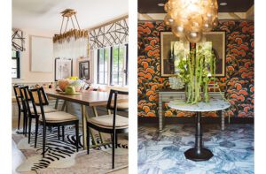
Currey & Company at High Point Market, Spring 2012: a design scheme with some of their new Moroccan-inspired line.
It isn’t enough nowadays simply to have great product and hope that you are going to catch everyone’s attention and fill hundreds of orders. You need to be able to sell your dream…and, most important, sell how your lighting, furniture and accessories can help attain that dream.
This is what sets High Point Market apart from the rest. It is our equivalent of Fashion Week in the couture world, with 180 buildings and 10 million square feet of amazingly designed showrooms.

Sarreid, where antiques and contemporary pieces have been thoughtfully displayed.

Two’s Company, presenting their new collection with Dransfield & Ross. Here a large portion of the stand has been dedicated to the “Artist’s Studio,†which introduces the theme of this new collection rather than displaying the product.
These showrooms have the luxury of space, but there is also more attention placed on setting the mood and tone rather than simply piling a mountain of product on shelves. Each market has been carefully planned and designed, just as any interior designer would plan a project for their client.

Halo, with a strong theme and the strongest attention to detail. This showroom had wonderful music playing and all the candles were lit, adding another layer to the experience.
So if you are on the hunt for pieces that fit a warmer palette, a strong nautical theme or rustic country style…

Four Hands: the walls in this very large showroom were creatively styled with posters, paint cans and spools of colored thread, adding an element of flair to their products, which are more classical in design, and instantly lending every piece an entirely new level of sophistication.
Or perhaps you are a fan of a richer palette, filled with color and pattern and layer upon layer of exquisite detailing…

The Tony Duquette room at Baker. Here they have used the most classical elements from their Stately Homes collection mixed in with these very eclectic statement pieces, showing how the two can be used in harmony to create unique looks.

Century Furniture. Every piece can be seen in various finishes throughout the many vignettes in the showroom. No detail has been left out, with wall coverings, fabric and paint selections made to enhance the presentation.
Visiting High Point Market is not only about the experience of coming face to face with each vendor’s product in every finish and size. It also leaves us energized and inspired about how those product lines can help create the rooms that will fulfill our clients’ dreams.

Hickory Chair: unconventional layouts creatively enhance every piece without clutter and with the utmost care given to color and design sensibility.
–Jennifer Mehditash
Interior designer Jennifer Mehditash shares the things that inspire her via the style blog Dec-a-Porter, which was recently chosen as a finalist for Best New Design Blog at the 2012 Design Bloggers Hall of Fame.
Share
![NEH-Logo_Black[1] NEH-Logo_Black[1]](https://nehomemag.com/wp-content/uploads/2022/08/NEH-Logo_Black1-300x162.jpg)


You must be logged in to post a comment.