Design in Depth: Deliciously Red
February 22, 2012
By Stacy Kunstel
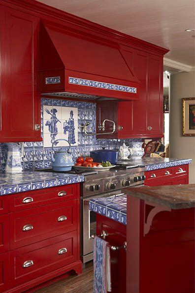
Red. Can’t get it out of my head. Maybe it’s a craving for the heat of the sun after too many cool days in a row, but everywhere I look I want to see red. We so rarely see real red in interiors these days. It’s just too intense a color for most. But I vividly recall styling the kitchen of interior designer Wendy Valliere in Stowe, Vermont, and thinking about how mouth-watering her red kitchen cabinets were.
Wendy said she matched the color to a favorite lipstick. The painting process took four coats with a final coat of varnish that would protect the paint from fading due to ultraviolet rays.

Photo by Michael Partenio
The most famous red I’ve heard of, but never had a chance to see, was the office of Diana Vreeland, the famous Vogue editor. Can you imagine such an intense color for your office walls? She was formidable in many ways.
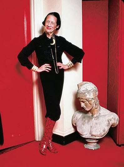
Photo courtesy of www.luxuryobsessed.com
Her book Allure is one of my favorite styling tools for an injection of red in a photo.

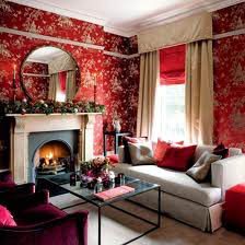
Red is often displayed as an accent or solid color in a space, but I love it when it is the dominant color in patterned wallpaper. This is an image I’ve seen a number of times on the web, but never with any attribution. If you’re the designer, I would love to credit you!
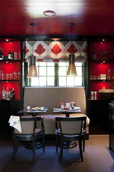
The most important thing is that the designer must command the red; the red cannot command you. Designer Claire Maestroni of Mis en Scene in Greenwich used red in the backs of the cabinets in her home. I love that the red goes across the ceiling as well.
Share
![NEH-Logo_Black[1] NEH-Logo_Black[1]](https://b2915716.smushcdn.com/2915716/wp-content/uploads/2022/08/NEH-Logo_Black1-300x162.jpg?lossy=1&strip=1&webp=1)


You must be logged in to post a comment.