Jason Oliver Nixon: Piling on the Patterns
July 19, 2011
John and I are known for employing gobs of color in our interior design projects: why leave a wall white when it can pop with pink perfection or smolder in cerulean? Layering patterns upon patterns is another signature John Loecke, Inc. look. A bare wall looks downright naked; do it up in a fabulous floral wallpaper! Then throw in a few more patterns on the sofa, armchairs, settee and chaise. But don’t stop there: add some paisleys and geometrics and exploded graphics to your wall treatments, floor and lampshades. And don’t forget to embellish the matting for your artwork, perhaps in plaid…
Does all of this sound slightly overwhelming, heady, and perhaps a tad cacophonous? Well, it’s not. Take a look at these before-and-after shots to see how piled-on patterns can really give a room some zip and zing.
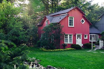
Here’s a home that John and I remodeled on the eastern end of Long Island. The circa-1850 cottage looked good on the outside but lacked any architectural interest on the inside. The home was a big snooze until we took it from dull and drab to absolutely delicious.
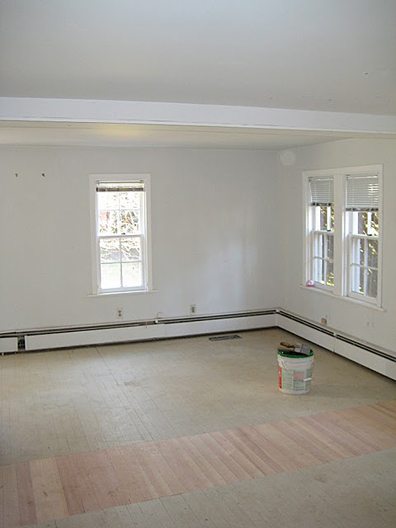
Here’s the living room of the Hamptons home before John and I tackled the space. A run-of-the-mill white box, n’est-ce pas? We decided to use pattern and a playful, carefree abandon to invest the living room with visual interest and a heightened level of engagement.
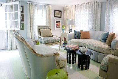
As you can see below, the white box now looks pretty darn wonderful, like a big ol’ Christmas present. Attribute the room’s transformation to the use of patterns in the space. There are probably twelve different patterns inhabiting this living room, but the mix really works. The pattern play is both delicious and soothing. “Mixing patterns makes a room more interesting,†says John Loecke. “You can’t figure out the room instantly. Patterns make the space more personal and engaging. Patterns also make small rooms seem larger and large rooms more intimate.â€
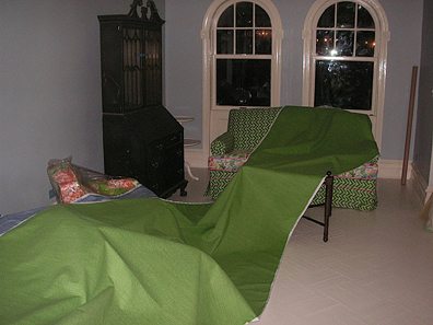
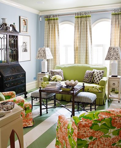
Our living room in Brooklyn, New York, was sadly devoid of sizzle when we purchased the home. Sure, there were great arched windows, but that was about all that the space had going for it. B-O-R-I-N-G! And who wants to be boring? If you want to be boring then go read another blog.
Ta-da! Our living room after John and I layered numerous patterns, from hydrangeas to stripes, trellises, geometrics and animal prints, finished off with grosgrain ribbon detailing. So what’s the key to pulling off the pattern play? Here we used green as a neutral, so any pattern with a touch of green in it could be used to further the storyline. When mixing patterns, choose one hue that runs throughout the space and gives it a visual continuity.
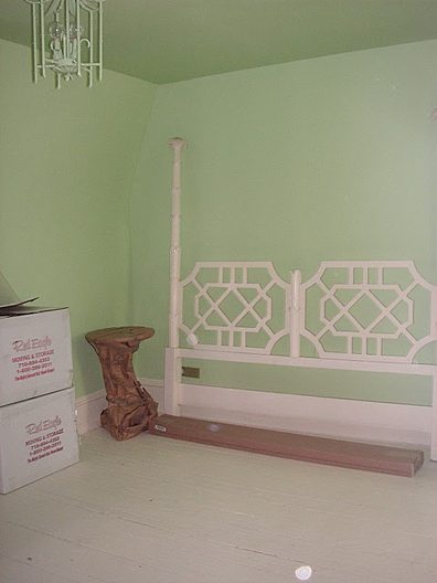
Our master bedroom was pretty when painted green. But it lacked verve and zest. And we live for verve. We decided to throw in some patterns, and the results were stunning.
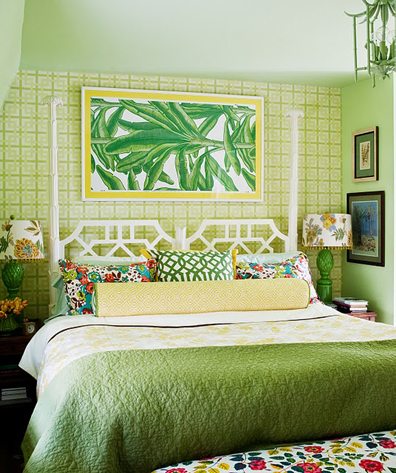
Wow-wee, huh? A few patterns transformed our minty green bedroom into a showpiece. The wallpaper anchors the space behind the bed while the patterns on the bed linens beckon, a siren call to sleepy-time splendor. And how about those libidinous lampshades? They practically shout, “Hello, sailor!†And the framed Dorothy Draper wallpaper over the bed offers a jaunt to the tropics without having to leave the bed.
–Jason Oliver Nixon
Jason Oliver Nixon is one half of the Brooklyn-based interior design firm John Loecke, Inc. Nixon also edits the Demystifying Design blog, a go-to source that breaks down great design and brings it home.
Share
![NEH-Logo_Black[1] NEH-Logo_Black[1]](https://b2915716.smushcdn.com/2915716/wp-content/uploads/2022/08/NEH-Logo_Black1-300x162.jpg?lossy=1&strip=1&webp=1)






You must be logged in to post a comment.