Editor’s Miscellany: Getting Style Nailed Down
April 14, 2011
By Kyle Hoepner
We all know that design fashions ebb and flow over the years. Generally the incoming tides get a lot of attention–just think of the number of stories you’ve seen recently about ikats and animal prints, for instance. I wonder, though, if we aren’t living through a little golden age of nailhead trim without quite realizing it. Looking around in shops, online and in other magazines I see nailheads everywhere, and a recent stroll through the Boston Design Center turned up many more examples.
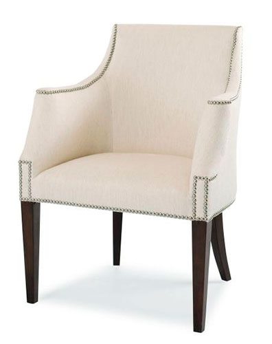
Easiest to find are simple, traditional uses of nailheads as a way of emphasizing the architectural contours of a piece of furniture–as in this dining chair from Century Furniture.
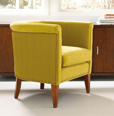
Another chair I saw recently at Mitchell Gold + Bob Williams adds a slight twist by mixing nailheads in two different scales.
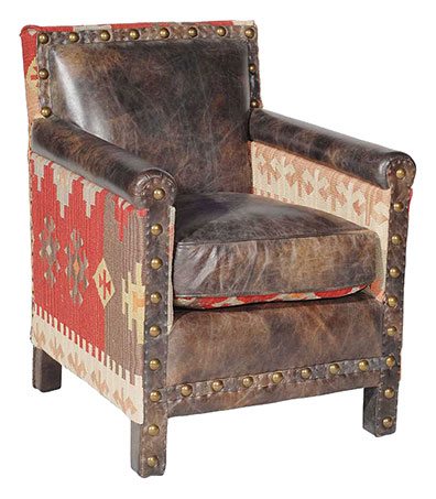
This reminds me of one of my own favorites, the emphatic effect of large antique nailheads, well spaced, as in a chair like this one (which, incidentally, I already mentioned once in a recent post about Maison & Objet).
I saw a similar combination of flatweave carpet and nailheads not long ago in a totally different context. During a visit to Finished in Fabric in Connecticut, owner Susan Bijleveld showed me this over-the-top stair they had worked on with interior designer Samuel Botero. The treads are wrapped in mismatched pieces of kilim secured with nails at each edge. (Unfortunately you can’t really see the nails in this image, but the overall effect is still worth a glance.)
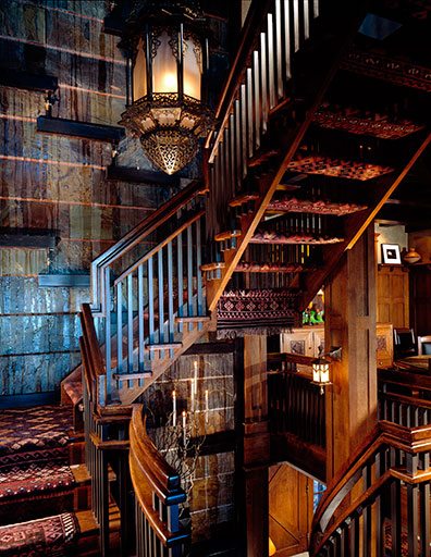
From Architectural Digest, February 2008. Photo by David O. Marlow.
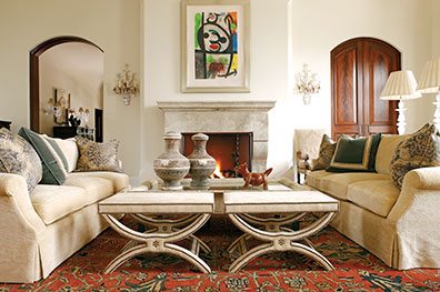
More elaborate applications of nailheads aren’t hard to find either. Here’s a house in Connecticut that appeared recently in Atlanta Homes & Lifestyles.
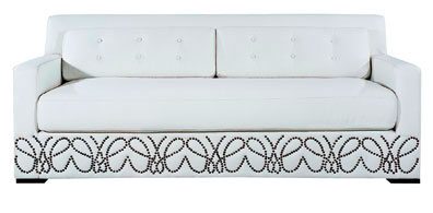
For still greater graphic impact, check out the Sydney sofa from Shine. Cheryl and Jeffrey Katz found this beauty for New England Home‘s Design Discoveries section a few issues back.
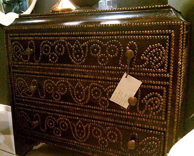
Question: Could you take it further than this amazing Prakash chest I came across at Furn & Co.?
Answer: Yes, in a way. Here are nailhead medallions on the doors to the Oxfordshire dining room of furniture designer Ashley Hicks (son of the legendary David Hicks).
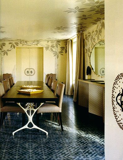
From World of Interiors, January 2011. Detail of photo by Simon Upton.
Once on the subject, I started noticing similar treatments all over the place, as in this pillow at ICON Group…
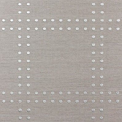
…or the new “Rivets†collection of wallpapers from Phillip Jeffries carried at Webster & Company.
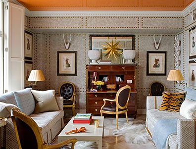
I’ll leave you with a room by designer Jeffrey Bilhuber. Walls “paneled†with nailhead outlines, high-gloss orange ceiling. Is this just killer, or what?
Pretty much any way you look at it, styles like these hit the nail on the head.
Share
![NEH-Logo_Black[1] NEH-Logo_Black[1]](https://b2915716.smushcdn.com/2915716/wp-content/uploads/2022/08/NEH-Logo_Black1-300x162.jpg?lossy=1&strip=1&webp=1)






You must be logged in to post a comment.