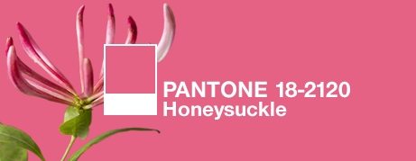
Linda Merrill: Honeysuckle, Pantone’s 2011 Color of the Year
January 18, 2011
First, let me say that I am honored to have been asked to be the first guest blogger on New England Home Magazine‘s new blog. We have a long relationship and I’m excited for the magazine to take this step into the world of interior design blogging. Fans of the print magazine will have the chance to get to know the talents behind the pages in a more personal way, which will make reading the magazine all the more special.
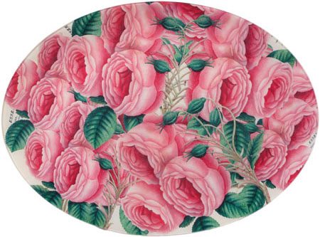
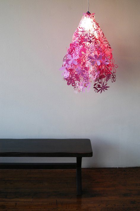
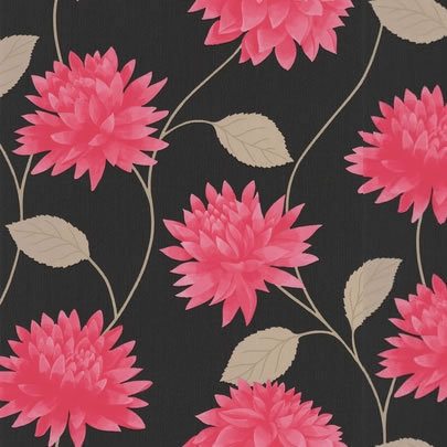
Now, on to color! Each year, the color experts at Pantone forecast a “Color of the Year†that they predict will be very popular in fashion, product packaging and home design. Turquoise was least year’s “it†color and this year Pantone has predicted Honeysuckle pink to be the big color story. I have to admit that long before I realized how much I loved pink and started to incorporate it into my own decorating, I would automatically gravitate towards any magazine on the rack that featured a pink cover.
Pantone says of this bright, happy color: “Energizing Honeysuckle lifts spirits and imparts confidence to meet life’s ongoing challenges.†Well, we could sure use it! Even if pink isn’t your go-to color, one can’t doubt that it is a happy and optimistic hue. With its undertone of red, this particular shade of pink is deceptively sophisticated.
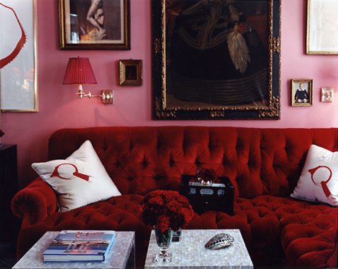
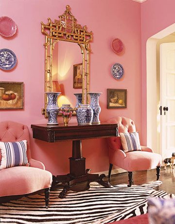
While no one is suggesting that we all run out and repaint our living rooms pink, if you’re looking to add a little optimism to your color palette, even just a touch is a great starting point.
What do you think? Will pink become a popular choice in home decor–even in über-traditional New England? I’d love to know your thoughts.
–Linda Merrill
Linda Merrill is a New England-based interior decorator whose blog, ::Surroundings::, has been named to numerous top design blog lists. She is also founder and moderator of The Skirted Roundtable, a popular podcast series that focuses on interior design and interviews with legends of the design world.
Share
![NEH-Logo_Black[1] NEH-Logo_Black[1]](https://b2915716.smushcdn.com/2915716/wp-content/uploads/2022/08/NEH-Logo_Black1-300x162.jpg?lossy=1&strip=1&webp=1)





You must be logged in to post a comment.