Perfect Partners
January 2, 2013
A suburban Boston house combines gloriously feminine curves and quietly masculine lines for an ideal marriage of exuberance and restraint.
Text by James McCown Photography by Robert Benson
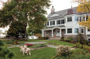
Jan Gleysteen loves curves. “I challenge you to find a space here that doesn’t contain a curve,” he says, describing this Shingle-style house he designed in the western suburbs of Boston. This symphony of curves—as expressed in the exuberant millwork, curved and vaulted ceilings and an oval breakfast room—sets up a dialogue the architect sees as the basis of his artistic expression.
Straight lines are all about order and control, Gleysteen explains. But curves give the architecture its real mojo. “Human beings are drawn to architectural curves because they relate to the curves of the human body,” he says. The Shingle style, he continues, is essentially grounded in the Victorian style, with its love of curves and asymmetry. “It’s a very appealing and voluptuous kind of architecture. It’s all rooted in human sexuality.”
As we all know, though, too much of anything can be, well, too much. Curvy and voluptuous can escalate to brazen and blowsy without a bit of moderation. No such thing happens here, thanks to Gleysteen’s wise introduction of just enough linearity to keep all those curves in check. “The idea in this house,” Gleysteen says, “is to bring the disorder of the Shingle style into order.”
The house presents a symmetrical front facade whose centerpiece is a temple-like entry portico. Above, the second story holds a window inspired by the work of Italian classicist Andrea Palladio. Stone on the lower portion of the house weds it to its site. While the front is all about control and symmetry, the rear is, says Gleysteen, “a collision of geometries one would find in an Italian hill town.
The contrast between exuberance and control continues inside, where Gleysteen was charged with designing a home that offers casual comfort to its young, growing family while maintaining the level of elegance and formality the parents like for their frequent entertaining.
“It’s a large house for a large family,” says interior designer Kate Coughlin, who collaborated closely with Gleysteen on the design. The first and second floors comprise almost 10,000 square feet, not including the fully built-out basement. But it’s not a house where any room is cordoned off or off limits. “I say use all of your rooms, or why have them?” Coughlin says.
The entry hall is worthy of “Downton Abbey.” Gleysteen put a classical spin on the design of the double-height space, which he compares to the interior courtyard of an Italian villa. “It’s an entry cortile,” he says. “There is a cross-axis around which we placed the other programmatic spaces. The main east/west axis ties together the more formal dining and living rooms in the front of the house.”
The daunting scale of the entry created a challenge for the interior designer. “It’s huge. It was a very hard space to do,” Coughlin says. Despite the space’s size, the exquisitely detailed classical millwork, all designed by Gleysteen, left little room for paintings, furniture against the walls and other elements. “Everything would have felt that it was just on the perimeter of the space,” she says.
Coughlin defined the area with wood flooring in a square-within-a-square pattern, then added a linen-wrapped table with a round top and jaunty angled square bottom—a shape that mimics the curves and angles of the entry. Murano glass light fixtures cast a glow from the ceiling high above.
Just as the home’s exterior represents a vibrant contrast front to back, so does the interior.
Formal living and dining rooms flank the foyer, while the more casual rooms used for everyday family living occupy the back half of the house.
In the living room, a tranquil space outfitted in a palette of soft neutrals and pale blue, Coughlin unified cozy seating arrangements by putting a roundabout tête-a-tête in the room’s center. “I like groupings in a living room to be one big circle so everyone can talk,” she says. “I want everyone to feel they are at the same party.”
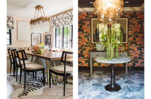
On the opposing side of the entry cortile is the formal dining room, which Coughlin describes as “the one surprise in a house that is otherwise very serene.” Here, it’s all about color and shine. Wallpaper in a bold floral of purple and green against a chocolate background contrasts with the white millwork. Chairs upholstered in a fresh citrus hue surround the dark wood table, and a Venetian mirror and a wooden chandelier finished in silver gilt add sparkle to the scene.
Things take a casual turn in the rooms at the rear of the house. Coughlin’s design for the family room began with the raised stone fireplace that forms the focal point for the space. A color scheme that echoes the fieldstone and granite brings together beiges, grays and blues. A suede sectional sofa big enough for the whole family cozies up to a large coffee table that can accommodate a spontaneous game of checkers or Monopoly. Gleysteen added cherry beams to soften the high arched ceiling, and Coughlin had the beams pickled to lend an extra sense of warmth.
The kitchen blends classic and contemporary. A coffered ceiling, glass-front cabinetry and a wood-topped island speak to the former, while stainless-steel appliances, clean-lined chairs and clear spherical light fixtures nod to the latter. The straight lines of the kitchen meet a pleasing contrast in the curvaceous breakfast area with its domed ceiling and arced wall of windows. A two-tiered round chandelier hangs above a circular table, and two thin lines of contrasting inlay in the floor further define the space.
Upstairs, the purple-and-green combination found in the dining room is repeated in the master bedroom. “The client saw this fabric and she said, ‘I have to have it,’ ” says Coughlin of the sofa covering. “The husband originally thought it would be too flowery for him, so we countered it with a headboard and footboard that are very angular and solid. There’s also a green geometric rug that doesn’t look too feminine.”
Inside and out, upstairs and down, a masculine/feminine, reserved/sensuous dichotomy infuses the entire home. “It’s the attraction of opposites,” Gleysteen says.
Architecture: Jan Gleysteen
Interior design: Kate Coughlin
Builder: Gilbane Development Company
Share
![NEH-Logo_Black[1] NEH-Logo_Black[1]](https://b2915716.smushcdn.com/2915716/wp-content/uploads/2022/08/NEH-Logo_Black1-300x162.jpg?lossy=1&strip=1&webp=1)




You must be logged in to post a comment.