Once More to the Lake
November 7, 2012
At lightning speed, a design duo lightens, brightens and personalizes a New Hampshire cabin, creating a getaway to foster years of sweet family memories.
Text by Megan Fulweiler Photography by John Gruen Produced by Kyle Hoepner
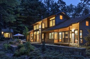
Anyone might think, given its 10,000 square feet, that this home’s pre-furnished condition would have been a blessing. The new owners were eager to get their brood ensconced by summer, after all, and a complete interior—especially one in excellent shape—was a plus. And the Meredith, New Hampshire, location by a lake was drop-dead, postcard-worthy beautiful, so why did the decor matter?
Well, as they say, “When the shoe doesn’t fit, it doesn’t fit.” The classic cabin palette of pine-green and red should have made its new occupants feel cozy, but instead it made them feel closed in. And where were the set-your-wet-bathing-suits-down-here furnishings and fabrics they wanted as parents of four active kids?
Acknowledging the need for some speedy intervention, the couple recruited interior designers Michael Carter and Douglas Truesdale of Boston’s Carter & Company. Not a duo to balk at anything so minor as an incredibly short deadline, the men rose to the occasion, pulling together an impressive presentation that they staged (think endless boxes of samples, fabric swatches and unfurled carpets) in their client’s New Jersey home in March. “Our challenge,” says Carter, “was to create a retreat our clients could love—one that matched their good taste and sophisticated aesthetic. The house was impersonal. We needed to give it a soul.”
No surprise, really, the owners awarded everything they were shown an enthusiastic thumbs-up. Come July 1, they congratulated themselves, they’d be in their lakeside abode, and the lodge ambience that felt a bit too clichéd would be gone like the wind.
Like the wind was how the designers had to function, too. “It was so much fun,” recalls Carter. “We felt like race horses going out of the gate. There was a single vision, one perfect snapshot in mind, and no time for second guessing.”
At turbo speed the designers whitewashed the walls above the honey-gold paneling and ousted yesterday’s stiff furnishings. Presto chango! Immediately the house felt airier and more open to the outdoors. Steering clear of jarring colors and patterns, the designers chose instead soft blues, browns and grays—soothing colors to complement the surroundings and, at the same time, update the mood.
“I hear the lake water lapping with low sounds by the shore…I hear it in the deep heart’s core,” Yeats—a lake lover himself—once penned. Having spent boyhood summers here, the husband had a roster of sweet memories and was looking to create similar ones for his family. With that in mind, Carter and Truesdale launched a pilgrimage up and down the coast searching for unfussy pieces that would lend the home character and become part of an enduring summer backdrop. A period eighteenth-century American grandfather clock with brass fittings was discovered in a local shop and installed in the foyer to join a pair of handcrafted benches unearthed in Maine and a stately antique wooden stag snapped up in Connecticut. The last—resting atop an Adirondack-style console—locks eyes with visitors coming through the front door.
The dining room, which projects out toward the lake on three sides—“like the bow of a ship,” says Carter—was given a new table and Windsor-style chairs anyone would swear were two centuries old. Understated, and as welcoming as a pile of blueberry pancakes, the room practically begs for leisurely gatherings.
Wool, duck canvas, leather…in came a steady influx of sturdy fabrics to ease vacation living. Sumptuous wool curtains in a soft muted plaid were hung, antique carpets with a history of durability were laid and prints and watercolors were arranged on walls. In lieu of the standard taxidermied prize above the living room hearth’s hefty mantel the designers mounted an antique Black Forest–style carved stag’s head. Indeed, there are a number of good-looking antlers (including a stunning antler-framed mirror). “The house is so large and spacious, we could spread them around without worry it was ever too much,” Carter explains.
Never letting up on the gas, the talented team maintained a non-stop flurry of activity for three months. The home’s hardware stayed in place, but the light fixtures were swapped for ones that were less ponderous. “There was too much testosterone in the prior lighting. We tamed it,” Carter says. Rather than a blast of illumination, today’s beams cast a toasty glow on the paneled walls.
In a flash, two formerly non-functioning balconies at either end of the living room were transformed. One became the wife’s office, complete with an antique desk above which a grid of framed ferns riffs on the area’s lush flora. A dainty chaise was found to roost beside the window, affording her a spot for resting and taking in views. The opposite balcony was turned into a cozy reading room, the ideal niche for inevitable rainy days.
Maximizing the home’s hillside site, the children’s bedrooms are situated below the ground floor on the walk-out level. Heaven for them translates to opening a bedroom door and trotting straight to the lake for an eye-opening dip before breakfast. Located above on the main floor, the sunny parents’ suite may not have that particular luxury, but it has plenty of other benefits, like a lofty ceiling and an abundance of natural light. Formerly painted a deep red, the current room is a pale blue-gray, a color that teams well with the rustic architecture and provides serenity. And where do guests sleep? Their refurbished quarters perch above the attached garage.
Charged with seeing to all the details, Carter and Truesdale also trucked in smaller everyday necessities, everything from dishware to linens. As the deadline drew nearer, their tempo accelerated until finally the big day dawned. “Douglas and I were literally backing down the driveway as the family was pulling in,” recalls Carter with apparent delight. The two designers have been friends forever, but Truesdale recently joined the firm, so this was the pair’s first collaboration. Needless to say, it most definitely won’t be their last.
Interior design: Michael Carter and Douglas Truesdale, Carter & Company
Share
![NEH-Logo_Black[1] NEH-Logo_Black[1]](https://b2915716.smushcdn.com/2915716/wp-content/uploads/2022/08/NEH-Logo_Black1-300x162.jpg?lossy=1&strip=1&webp=1)





You must be logged in to post a comment.