Tour a Cape Cod Home that Seamlessly Blends with The Natural Landscape
September 4, 2018
With its subtly inventive architecture and interior design, a Cape Cod house lets its lovely waterfront location play the starring role.
Text by Bob Curley Photography by Michael J. Lee Produced by Karin Lidbeck Brent
How do you create a distinctive design for a home where the intent is to make it disappear into the landscape? In the case of this seaside home on Cape Cod, the answer lay in natural building materials, copious use of indoor-outdoor furniture, and windows—lots and lots of windows.
The home, overlooking Pleasant Harbor in Orleans, was subject to restrictions imposed by the local coastal resource commission. Rather than seeing this as an obstacle, however, the owners, architects, and designers turned it into an opportunity.
Largely limited to working within an existing foundation, Hutker Architects leveled the middle of the unremarkable structure to create a reimagined “life space” comprising an undivided living room, dining room, and kitchen. Set between the retained bedroom and garage wings, the center of the house was built from the ground up with an eye toward creating a unified exterior design as well as maximum transparency and minimal intrusion on the natural landscape.
“The original house was strangely connected, with odd rooflines and additions; it really didn’t work,” says Charles Orr, a principal at Hutker Architects. “The majority of our work was done in the center. You approach the home from a higher elevation, and we wanted you to be able to see through the roof, and even above the roof to the view.”
The open “life space” room was crowned with zinc-coated copper, while a new front porch was given a flat top that creates a horizontal line across the face of the home and serves as a unifying “roof between roofs,” according to Orr.
The angled front porch, which adds a contemporary touch, was an addition outside the original footprint, “but because it moved away from the preservation area, the coastal resource commission had no problem with it,” the architect says.
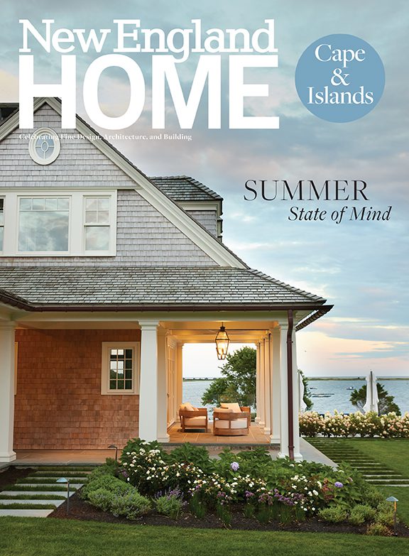
The home is clad in unstained western cedar and accented with local stone in the retaining walls and chimney, enhancing the harmony between the structure and surrounding trees and grasses—some extant, others added by landscape architect Kimberly Mercurio.
“Cedar weathers unevenly depending on its exposure to the sun and rain, and it doesn’t take long to happen in our saltwater environment,” notes Orr. “Credit to the client for having the vision to let that happen.”
Mercurio added native plants like hydrangea, bayberry, New England aster, inkberry, milkweed, and butterfly weed while removing invasive growth. “Everything needed to be as minimalist and low-maintenance as possible,” including the low-water lawn, she explains.
In the front, a trio of doors and a row of transom windows above the roofline let natural light in from both east and west. The rear of the center room is almost entirely windows and doors, including a sitting area that projects out into the landscape and toward the harbor. “It’s basically a glass box,” Orr says. “It feels like you are in the view, rather than looking out at it.”
Sliding French doors open onto a wide patio, with Mercurio’s subtle landscaping allowing for unobstructed water views over a two-foot-high stone retaining wall. A line of small upper windows hearkens back to the “divided light” of traditional Cape residential architecture (“Back in the day, you could only make glass so big,” Orr notes).
Inside, the tray ceilings, light fixtures, and furniture help define—but not divide—the living, dining, and food preparation areas of the life space. White-painted walls and the restrained color palette employed by interior designer Robin Gannon allow an undistracted eye to travel through the room to the water views beyond.
The doors and windows on the rear wall are intended to slide aside to let in the Cape’s famous summer breezes, so Gannon hung the pendant lights over the dining tables on solid poles to prevent them from swinging in the wind. Like the exterior cedar, the walnut in the Venegas and Company–designed kitchen was finished with the outdoors in mind. “Walnut is often stained darker in order to soften or mute its natural variations, but in this case, we embraced them and -highlighted them by lightening the wood,” explains Venegas and Company senior designer Michele Kelly.
Splashes of the owners’ favorite colors—periwinkle blue, bright yellow, and turquoise—are used sparingly but effectively, showing up on a repurposed dining room cabinet, throw pillows, and a Jill Rosenwald pottery bowl on a shelf by the fireplace, for example.
Furniture leans toward the midcentury modern designs favored by the clients, while the indoor-outdoor tables and seating help blur the divide between interior and exterior spaces, as do the stone fireplace, woven textures on chairs and lamps, and natural variations on surfaces like the quartzite kitchen countertop.
“It’s a home with beautiful views of the water, but we tried not to make it kitschy, with fish and boats everywhere,” Gannon says. “We do have that in places, but we kept it more modern. The design is aware of the surroundings, but we don’t shove it in your face every time you turn around.”
Gannon designed the unique two-piece dining room table with the lifestyle of the empty-nester owners firmly in mind. “I didn’t want them to feel like they are sitting at a big vacant table,” she says. “Each part seats up to six, but if two people sit there it still feels like an intimate dining experience.”
Likewise, the three-wing design of this summer home offers versatility when the couple’s three children come to visit. “When it’s just the two of them, they’ve got the master bedroom on one end and can close off the other wing, but when it’s a full house they still have their privacy,” says Orr.
The understated seaside theme and restrained use of color continue in the master and guest bedrooms. “I always want rooms to have their own personality, but there has to be a thread so they look like they belong in the same house,” says Gannon. Eye-catching details include horizontal stripes on draperies meant to evoke rippling water, a woven grass headboard on the master bed, textured green glass bathroom tiles, and faux bamboo lamps and bed frames. “There’s something to look at everywhere you go, but nothing screams ‘Look at me,’ ” says the designer.
Much the same can be said of this harbor-front home as a whole. “To me, the house takes a back seat to the view,” says Orr. “It’s subtle, and it requires a lot of restraint to design that way.”
Project Team
Architecture: Hutker Architects
Interior design: Robin Gannon, Robin Gannon Interiors
Builder: Von Thaden Builders
Landscape design: Kimberly Mercurio, Kimberly Mercurio Landscape Architecture
Share
![NEH-Logo_Black[1] NEH-Logo_Black[1]](https://b2915716.smushcdn.com/2915716/wp-content/uploads/2022/08/NEH-Logo_Black1-300x162.jpg?lossy=1&strip=1&webp=1)


You must be logged in to post a comment.