Maine Woods Modern
April 30, 2013
A dense forest surrounding a scenic cove proves an ideal backdrop for a seriously contemporary retreat.
Text by Maria LaPiana Photography by Trent Bell Produced by Karin Lidbeck Brent
The prospective buyer was understandably wary when he went to see yet another property for sale, after years of searching for that perfect sweet spot in Maine that had to be near deep water. For starters, he couldn’t see the forest (or the potential home site hidden within) for the trees. “I met the seller by the side of the main road—there was no access to the property—and we made our way through the densest woods for a long time,” he remembers. “We walked and walked and then suddenly I saw the blue of the cove, and Sheep Island, then the view across the cove. I found myself standing on a boulder, one of many that make up the shore. I started jumping from boulder to boulder, and I believe what I said at that moment is: ‘This is the place.”
Nestled in Brooksville, the three-plus-acre parcel spoke to him because it sits directly on Smith Cove, a deep, sheltered body of water known for boating, kayaking and spectacular sunsets. Within minutes, the excited buyer from Virginia was on his way to building the getaway he had dreamed of. Serendipity was along for the ride, because he noticed an architect’s sign in Blue Hill and moseyed in, without an appointment. He met with Bruce Norelius, then a partner in what is now Elliott + Elliott Architecture, and described the simple, contemporary, low-maintenance home he and his wife wanted. (Norelius, who would draft the original design for the house, has since moved to Los Angeles where he has opened his own firm.) JT Loomis took over as the project architect of record and, along with his colleague Matthew Elliott and builder Peter Woodward, made the couple’s secluded haven a reality.
The homeowners, especially the wife, were fully involved in the design and construction process. Even landscape designer Larry Maxim, who came along after the home was completed, would agree that the modest and modern home came to be thanks to a confluence of good ideas made better by collaboration.
And so, the woods were cleared to create a site that would showcase the deep cove as well as the natural setting framed by a canopy of trees. “The site was interesting,” says Elliott. “The view to the water is north and the sun is south, so it’s always tricky to reconcile that, to determine the shape and orientation of the building.”
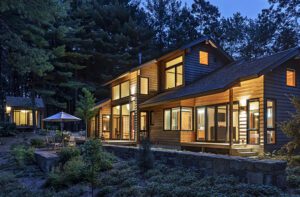
Natural light deeply informed the home’s design; by creating a 2,500-square-foot, linear structure with its high side to the south and low side north, the architects fashioned several points of visual interest and lots of outdoor rooms, including a sheltered courtyard. A screened porch opens onto a spacious Ipe-wood deck that leads across a terrace to a path down to the water. “A variety of outdoor spaces animates the site at different times of the day,” says Elliott.
Adds Loomis, “The design minimizes the visual impact on the busy little cove. It feels like a long, low-slung, very minimalist building that fits into the landscape quietly.”
“It’s very nice having a natural slope of ledge outcroppings,” says Maxim of his landscape design. “We put in plantings that are tipped and visible from the house. We thinned out the woods, put in second-growth trees, then tapered off into the native plantings.” He softened the look of cobblestones in the courtyard with creeping and wooly thyme, then added roses and a few perennials, “things that would blossom in late spring and summer.” Viburnums add a touch of colorful fall foliage.
Woodward, the builder, says the T-shaped home suits the site well. “It’s deceiving,” he says. “When you first see it, you question what it is, this linear bunker with industrial siding. There are not a lot of windows on the side you drive in on, and those that are there are frosted, or up high. The entrance makes you really want to know what’s behind it. And yet, when you’re inside the house, it’s interesting how much you feel like you’re actually outside.”
The architects pushed the envelope by specifying an array of commercial and industrial materials both inside and out, in response to the homeowners’ directive that the home require little to no maintenance. They intended to use it a lot (the husband says they come up every six or eight weeks, year-round), but they didn’t want to work when they were there. So the exterior is a combination of nicely gray-weathering Ipe siding and painted aluminum used both as siding and roofing. The ample and fairly indestructible fenestration design is composed entirely of an aluminum curtain wall system of windows and doors.
The top of the T houses the master suite and the shared spaces—the kitchen, dining and living rooms and the screened porch. The two guest rooms and garage reside in the smaller, perpendicular second pavilion.
“Our other home has a lot of big and little rooms; it’s divided in pieces,” says the husband. For this home, he and his wife wanted a place that gave them privacy but with space enough for guests, including their two grown children and their families. “Two separate pavilions separated by the entry work especially well,” he says.
On the inside, industrial influences abound, with concrete flooring throughout—even in the bedrooms—and light, bright open spaces adorned simply.
Dark woods ground the rooms, standing in contrast to lofty ceilings punctuated by recessed lights, canned spots and pendant lamps on long wires. The furnishings are a merry mix of sleek contemporary designs. “We’re working on a midcentury modern look,” the homeowner explains. “It’s happening over time.”
The dramatic kitchen, done in bold brushstrokes of red and gray, was long imagined in the wife’s eye as a dramatic counterpoint to the neutral palette throughout the rest of the house. She achieved success with shiny red metal cabinets, heavy gray granite counters, commercially inspired appliances and a stainless-steel backsplash. A trestle table with perfectly matched red dining chairs completes the look.
Preferring a vantage point that allows him to absorb the home and its surroundings, the husband proclaims the long granite countertop under wide windows his favorite spot in the house: “I can sit in a swivel chair at my desk there and look both ways…I can see the backyard or the cove. It’s doesn’t get any better. I love it there.”
Project Team
Architecture: Elliott + Elliott Architecture
Builder: Peter Woodward, Jon D. Woodward & Sons
Landscape design: Larry Maxim, Down East Landscape & Design
Share
![NEH-Logo_Black[1] NEH-Logo_Black[1]](https://b2915716.smushcdn.com/2915716/wp-content/uploads/2022/08/NEH-Logo_Black1-300x162.jpg?lossy=1&strip=1&webp=1)



You must be logged in to post a comment.