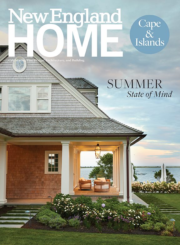
All Seasons’ Greetings
June 13, 2010
Text by Megan Fulweiler Photography by Brian Vanden Brink
A summer house is generally all about sun and bare feet. Some of the best-loved—with their piles of bleached seashells and informal dripping-bathing-suits-allowed decrees—close up tight as beach umbrellas when autumn leaves begin to fall.
For these forward-looking owners, such an abbreviated June-to-September schedule held zero appeal. On the contrary, the Chatham retreat they envisioned would welcome every equinox and solstice, including those whose icy winds can send you running for hot chocolate. They were even toying with the idea, as they told Polhemus Savery DaSilva Architects Builders, the locally based firm they’d recruited to execute their dream, of some day abandoning their Boston house and making their getaway a year-round address. “I wanted a comfortable home where we could experience the seasons, one that would evolve with us and be suitable as a primary residence down the road,” says the wife. “The previous owners were here for forty years. They warned us to come with all the supplies we’d need because once in place, we’d never want to leave. They were so right.”
Obviously, the site was already working its spell. Ask anyone involved in this project and after they’ve exclaimed over the breathtaking beauty of Oyster River lapping its way to Nantucket Sound right at the doorstep, it’s the contemplative quiet they laud. “You hear only shore birds, wind and waves,” explains Suzanne Little, an interior designer from York, Maine, who was also on board, as she has been for several of the owners’ previous homes.
Of course everybody’s landscape love affair aside, there were dilemmas, too. The idyllic setting included an aging house and several outbuildings. In order to move forward with the couple’s long-range plans, the existing house and two smaller structures needed to come down. Their combined square footage became the footprint for building—one that, due to environmental constrictions, the architects couldn’t exceed. “Wetland set-back requirements also limited the width of the house that could run parallel with the waterfront,” says DaSilva. And—another challenge—prime views lay perpendicular to the street.
Fortunately, constraints can yield the kind of inventiveness that leads to great architecture. Design principal John DaSilva, working with the firm’s president and CEO Peter Polhemus and Aaron Polhemus, chief operating officer and principal builder, has created a striking sanctuary. Every window frames heart-stopping views, and the dawn-to-dusk light is celestial. The team’s clever design ramped up the seduction factor of the site like never before.
Today’s skillful solution, in fact, recalls grand seaside estates of the past. A porte cochere just large enough for a car to pass through separates the 4,700-square-foot main house from the garage. Above the porte cochere is an office, and above the garage are guest quarters. The owners pause to unload their groceries into the mudroom (a special boon on rainy days) before making the graceful loop into the garage from the side. No beefy garage doors stand along the home’s front to distract the eye.
“Some of the best historical Shingle-style houses appeared as if they were wrapped with a shingle membrane that was cut like wallpaper to make openings,” says DaSilva. “They also appeared light—like balloons ready to float away but always tethered to the ground.” The same could be said of this design. Rather than the classic Cape Cod exterior of white trim and gray shingles, however, the trim is creamy-colored to “soften the contrast and allow the grid of the windows to be strong but not overwhelming,” the architect says.
Inside, the family room is tucked at the core with entry and den left (facing the street) and dining room, kitchen and master suite to the right. All the major rooms partake in the glorious south-facing views. But the double-height family room’s window bay juts out—“explodes” in the architect’s words—scooping up panoramic vistas from several directions. There’s even—how perfect?—a lighthouse on the distant barrier beach. Rather than plug the landmark dead center in the middle of the windows, DaSilva’s design cunningly slides it to one side. “Being off-center, it has more interest,” he says.
Unlike many modern couples, these owners eschewed the open eat-in-kitchen approach and requested a dining room. “The cozy kitchen is a great spot for my husband and me. But I love the idea of a dining room for larger gatherings and holidays,” says the wife. “This one is just right—elegant but casual.”
A handsome coffered ceiling lends character, while a surplus of windows affords more unencumbered views. At night, classically inspired twin chandeliers—one of Little’s thoughtful touches that keeps in mind that the table is often extended—flood the space with an inviting warmth.
The master suite’s smart first-floor location is a nod to a future when the owners may prefer not to jog stairs. Why bother, really, when by simply opening your bedroom door you can step out on the terrace, walk to the hot tub and tend your flowers? The wife is an avid gardener, which accounts for the ever-fresh bouquets blooming all over.
As they did for the other rooms, Little and the wife devised a restful, not overly summery palette to complement the outdoors. Pretty antiques are combined with new traditional-style furnishings, cleverly fudging centuries. Window treatments are consistently straightforward: matchstick bamboo shades in the bedroom, plantation shutters for the his-and-hers bath.
The bath’s soft aqua-colored walls and snowy Thassos marble floor, according to Little, give the room a tailored ambience that’s neither overtly feminine nor masculine. A dainty chandelier may be a frill, but certainly of the kind a man could appreciate. “These rooms have longevity. Nothing is too trendy. Down the road, they’ll still look good, never dated,” Little says.
Three additional personality-filled bedrooms are set aside for visiting children and guests on the generous second floor. No surprise, there’s a non-stop number of friends and family hoping for an invitation to this welcoming home be it a steamy July or a frosty December.
Project Team
Architecture: John DaSilva, Polhemus Savery DaSilva Architects Builders
Interior design: Suzanne M. Little
Landscape design: David Hawk
Share
![NEH-Logo_Black[1] NEH-Logo_Black[1]](https://b2915716.smushcdn.com/2915716/wp-content/uploads/2022/08/NEH-Logo_Black1-300x162.jpg?lossy=1&strip=1&webp=1)


You must be logged in to post a comment.