Sweeping Beauty
May 29, 2014
An architect takes classic New England style in a fresh direction, introducing fluid lines and graceful curves that give an Orleans house the drama its stunning site deserves.
Text by Megan Fulweiler Photography by Keller + Keller Produced by Karin Lidbeck Brent
Some people say architect Philip Johnson faked the tears he shed upon seeing Spain’s Guggenheim Museum Bilbao for the first time. Others insist his reaction was heartfelt and that the building, one of the twentieth-century’s most important, struck a deep chord because of its sweeping curves. Studies show people respond to curves on an emotional level, though the reasons why have yet to be explained.
One thing is for certain: the owners of this Cape Cod home adore their light-filled house and its view-expanding, livability-enhancing curves. Osterville, Massachusetts–based architect Doreve Nicholaeff is known for her skill at incorporating fluid curves to create contained sculptural spaces that are—as she describes them—“quiet, calming, and special.” Special in that they speak directly to her clients’ lifestyle and dreams, as they do here.
Charged with devising a retreat on a magnificent Orleans property (the kind artists swoon over) that could one day become the owner’s retirement destination, Nicholeaff unleashed her imagination. The couple wanted an inviting house to share with friends and with their three grown children (and perhaps, eventually, grandchildren). But they also longed for a home that would feel comfortable, “never cavernous” when they were alone, says the wife. Hardly an easy feat, but the final composition meets their criteria miraculously, providing intimate areas within a stunning modern plan.
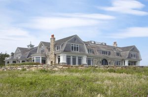
Unstymied by height restrictions, the masterful architect fashioned a solar-thermal house that incorporates a series of level changes culminating in a widow’s walk and a sky-embracing deck. Visitors coming up the drive recognize traditional New England shapes, though they’ve been given a fresh spin. The architect uses every opportunity to connect with the outdoors. And as if in welcome, tiered windows curve gently outward between the front facade’s twin gable ends. The windows flank a staircase that, says the wife, “is a work of art.”
More than just a means of conveying people from spot to spot, the stairs unfold “like a journey,” says Nicholaeff. The back and forth, the clever change of direction, adds drama without increasing the building’s height. The stairs begin at basement level and morph into a graceful double-stair that climbs to a north-facing landing and on to the second floor. A half-level above the second floor is the south-facing studio. Steps in the studio lead to the widow’s walk and an exterior landing with double stairs ascending to the panoramic rooftop deck. Islands, channels, inlets—the scene is dazzling.
In fact, according to Nicholaeff, the rich setting made it a challenge to figure out how best to position rooms so that their function and views would relate. Case in point is the kitchen, which repeats the rounded theme established at the front of the house. Since both spouses are passionate cooks, the layout was important: “We wanted to work and still be connected with our family,” says the husband.
The kitchen’s generous, ergonomically friendly island forms a semicircle. The outside edge is the cook’s territory. The breakfast area nestles into the middle of the semicircle, facing the curving windows on the opposite side. Radiating to the left and right are the living room and dining room, respectively. The wings embrace the landscape and shelter a harmoniously curved covered porch in between.
The owners are amazed that their kitchen offers up spectacular views and lets them see through to both ends of the house. That it still feels right when there’s just the two of them sharing meals is even more remarkable. “We don’t know how Doreve managed to make it simultaneously open and cozy,” says the wife with delight.
The second level has the same deft balance of privacy and adaptability. The secluded master suite—complete with rounded bath and covered porch—is set above the living room, while a spacious guest bedroom resides at the opposite end of the floor, above the dining room. The latter shares an adjoining bath with yet another guest room, while two more quarters for weekenders sit above the connected, three-bay garage.
Topping it all off, Boston interior designer Manuel de Santaren concocted a perfect blend of old and new, marrying antiques and artwork from the owners’ collection with a variety of contemporary upholstered pieces. The palette—from the window-lined living room to the owners’ bedroom—is soft and neutral, with a spattering of blue accents to riff on the shore location. “We wanted to honor nature, not compete with her,” de Santaren says.
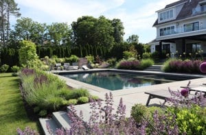
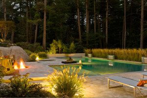
Indeed, Cambridge, Massachusetts–based landscape architect Gregory Lombardi labels the site “inspirational.” Such a paradise, though, doesn’t come without challenges. Lombardi was charged—along with the project’s senior landscape architect, Rob Calderaro—with not only forging a complementary setting for the architecture but satisfying myriad environmental regulations as well. Maintaining the stability of the coastal bank and providing a habitat for wildlife were as crucial as maximizing vistas. Lombardi and Calderaro accomplished all that and more. Invasive species were removed, and native plants introduced. Many existing trees were carefully preserved, and recruits that withstand salt and wind were added to the mix. A parade of lindens and a picket fence mark the pool’s upper edge. But it’s the four-and-a-half-foot retaining wall that defines the lower edge—hidden behind masses of flowering perennials and shrubs and doing its job without calling attention to itself or obstructing the views from pool, spa, or chaise—that is most ingenuous.
Watching seabirds soar or seals assemble on the distant rocks, the family is content. In fact, endings simply don’t get any better. The experts who made it happen attribute the fabulous outcome to the interested and involved owners. And the owners have nothing but praise for each and every one of them in return. •
Architecture: Doreve Nicholaeff, Nicholaeff Architecture + Design
Interior design: Manuel de Santaren
Builder: Kenneth Vona Construction
Landscape architecture: Gregory Lombardi Design
Share
![NEH-Logo_Black[1] NEH-Logo_Black[1]](https://www.nehomemag.com/wp-content/uploads/2022/08/NEH-Logo_Black1-300x162.jpg)


You must be logged in to post a comment.